Mama Chow's Kitchen Rebrand
Illustration
2025
Mama Chow’s Kitchen is more than just a food cart—it’s a tribute to family, tradition, and the craft of handmade food. Every dish served is a reflection of love, authenticity, and the belief that good food has the power to bring people together.
Rooted in tradition but designed for today, Mama Chow’s blends classic Chinese comfort food with a fresh, playful brand experience. From the first greeting to the last bite, the goal is simple: to make every meal feel like home.
With a focus on handcrafted dishes, community connection, and a warm, welcoming atmosphere, Mama Chow’s Kitchen is a place where everyone—from longtime regulars to first-time visitors—is treated like family.
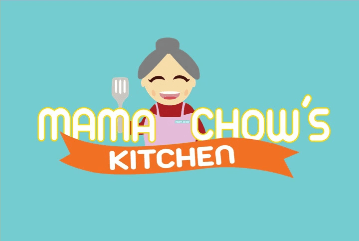
Brand History
Mama Chow is Jeff’s mother, his greatest inspiration in the kitchen. She taught him the importance of cooking with care, using fresh ingredients, and making every meal a way to bring people together. Jeff honors her legacy by handcrafting every dish with love—and sharing that love with his community in Portland.

Opportunity
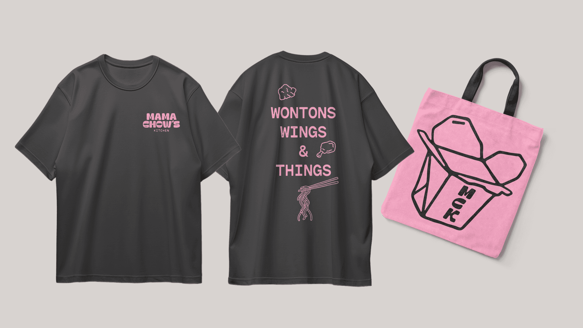
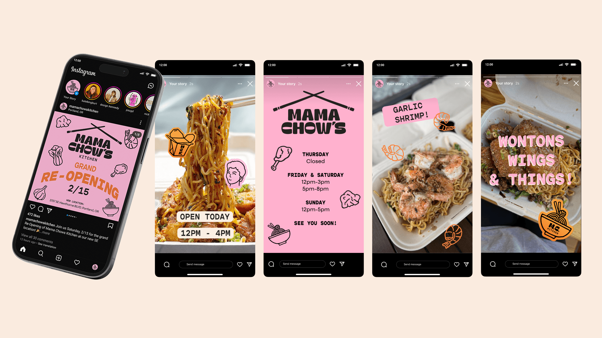
Mama Chow’s Kitchen has built a loyal following through word of mouth and quality food, but its current brand doesn’t fully reflect that reputation. The opportunity is to elevate the visual identity to better match the experience—making it more recognizable, cohesive, and competitive within Portland’s food cart scene. This includes creating clearer communication, stronger brand presence, and thoughtful extensions like packaging and merchandise to help the business grow while staying rooted in its community-driven values.
Strategy
The rebrand for Mama Chow’s Kitchen centers on highlighting what already makes the business special—fresh, handmade food and a strong connection to the local community. The strategy focuses on creating a welcoming and approachable identity that feels personal, authentic, and easy to engage with. By simplifying how information is presented and reinforcing a friendly, consistent visual language, the brand supports both loyal regulars and new customers while emphasizing the care and craft behind each dish.

Visual identity
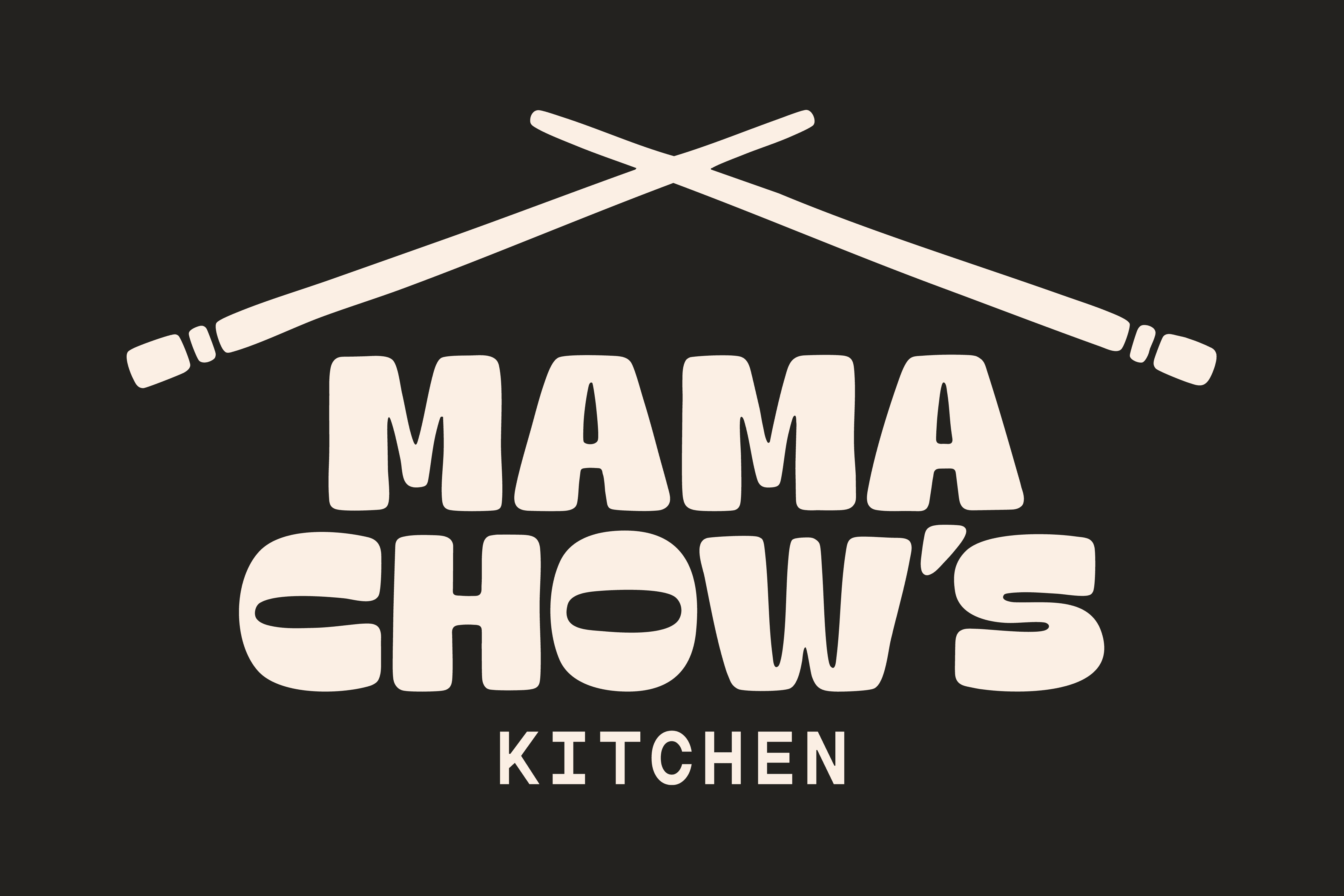
The primary logo representing Mama Chow’s Kitchen was designed to embody the brand’s handcrafted and welcoming identity.
Primary Wordmark
Secondary Wordmarks
Brand Colors
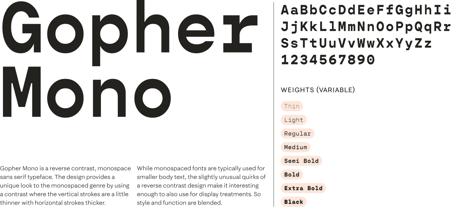
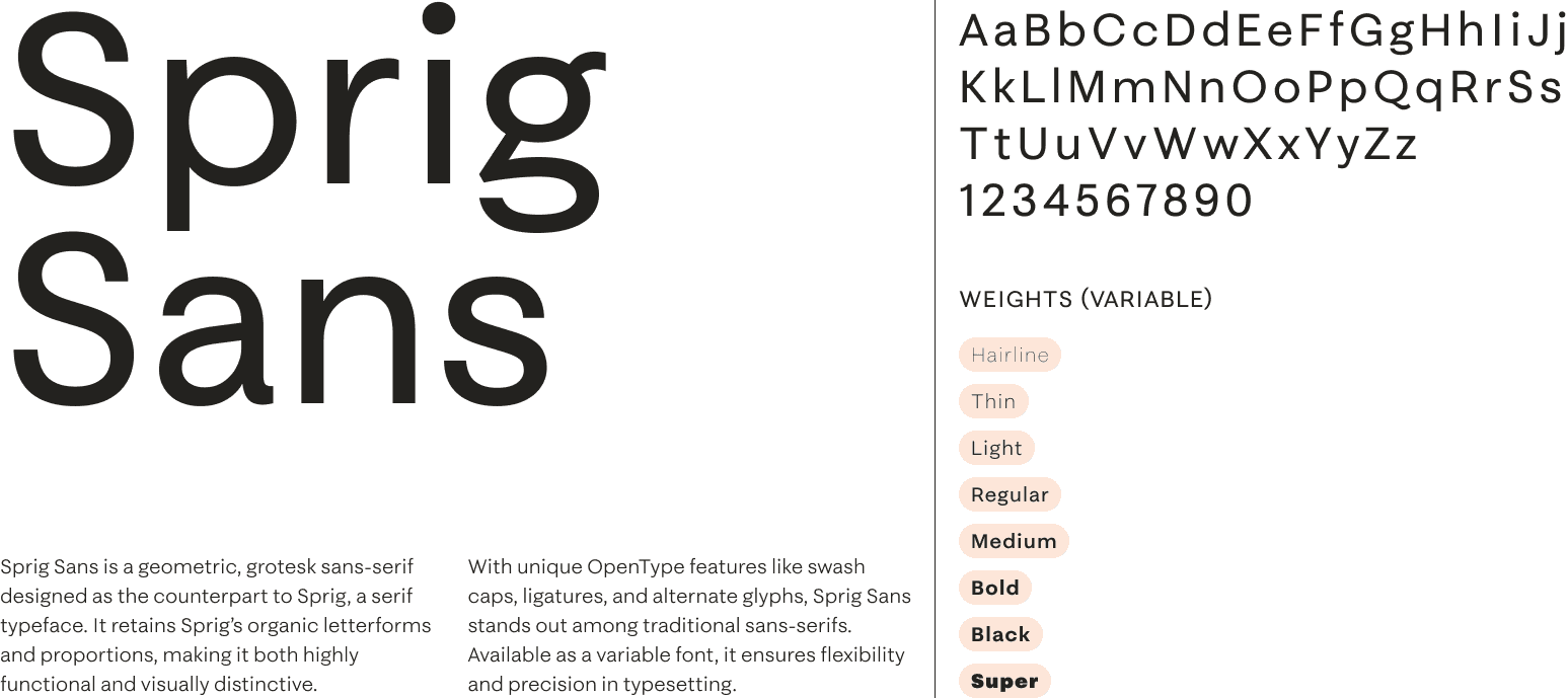
Type
Illustrations

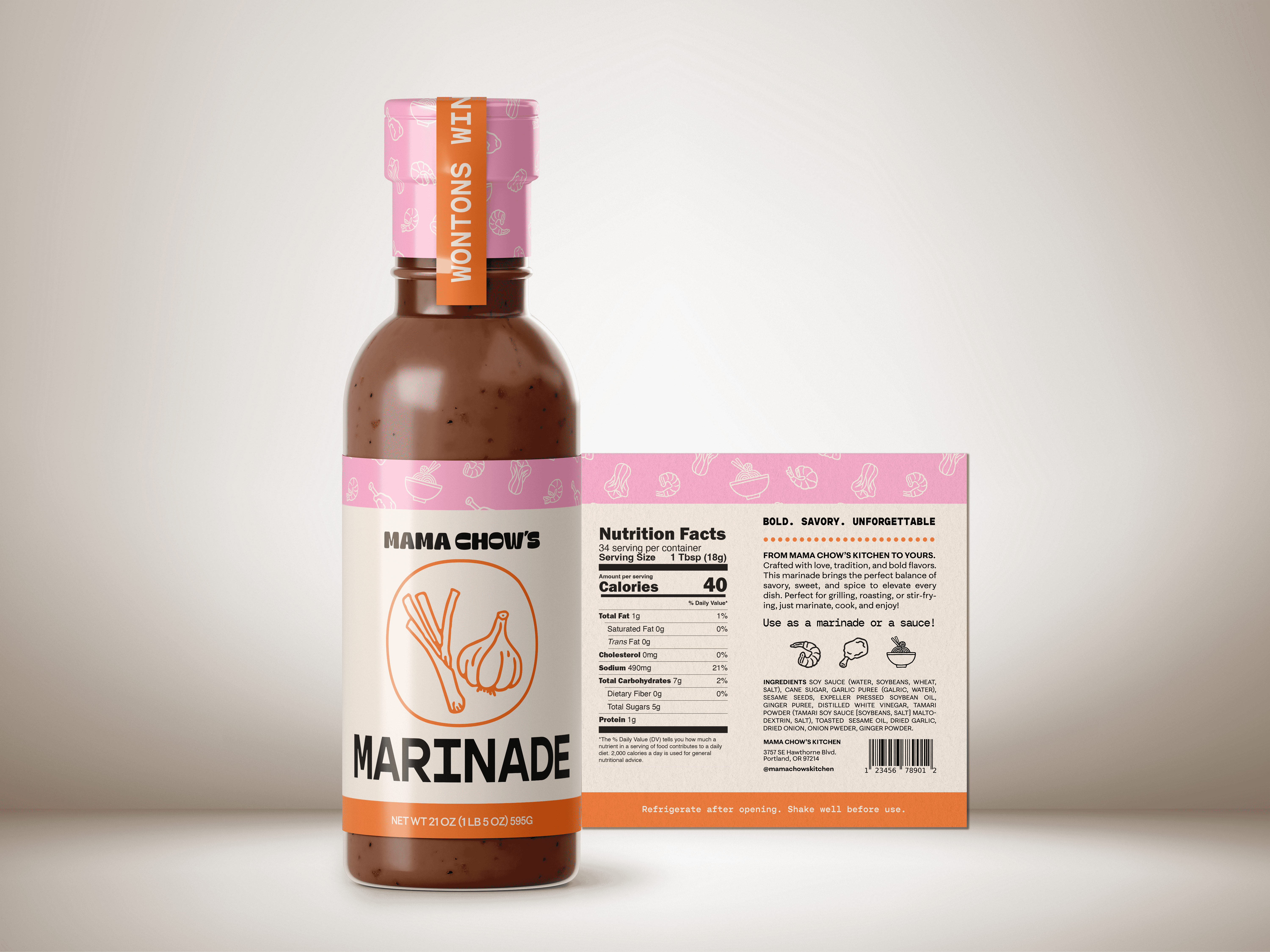
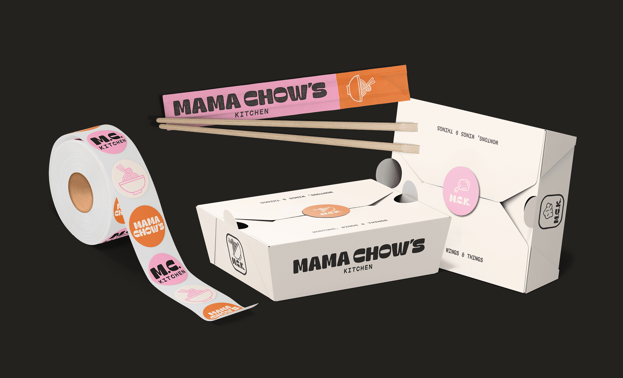
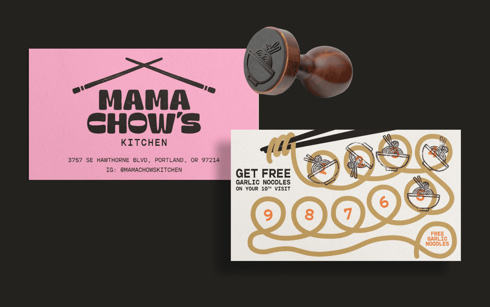
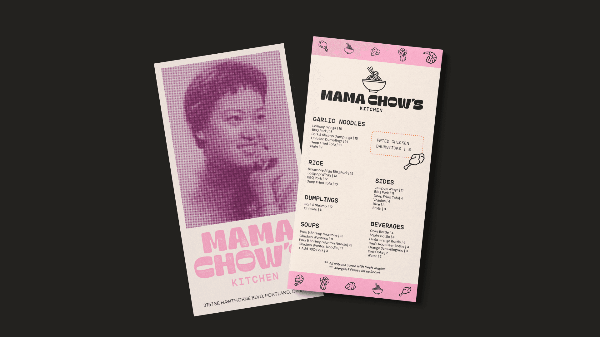
Brand in action