Nelson's Ice Cream
Branding
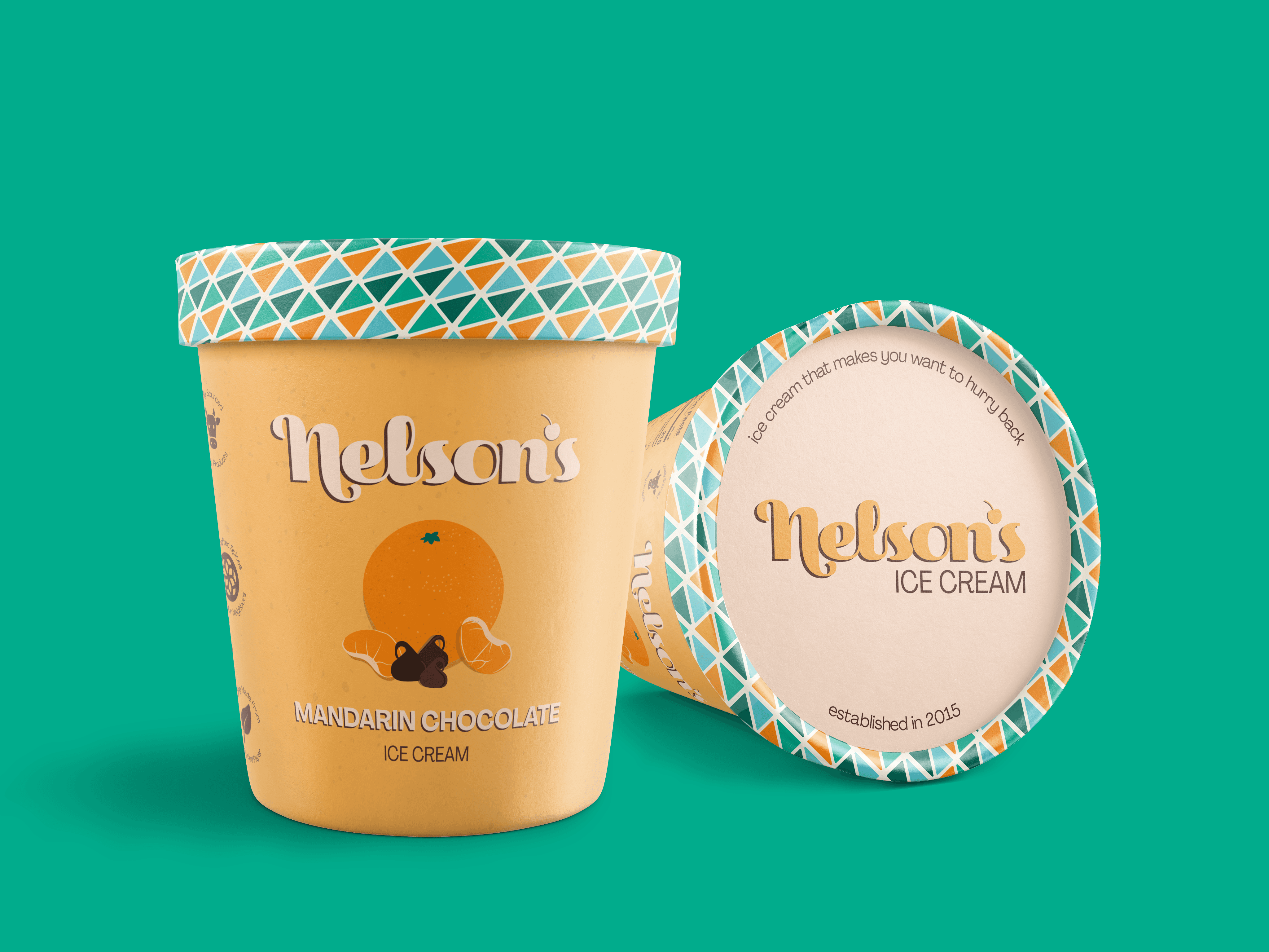
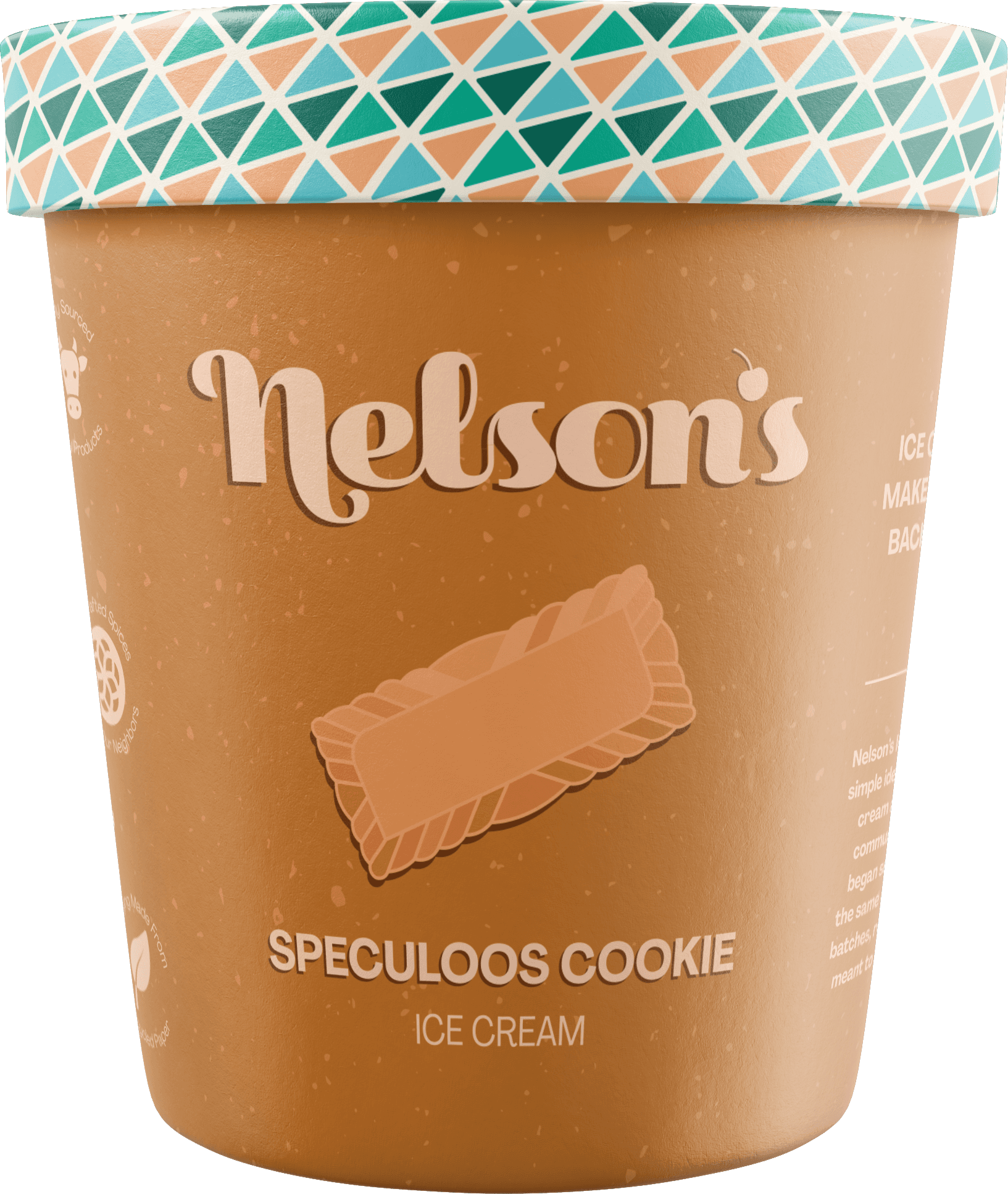
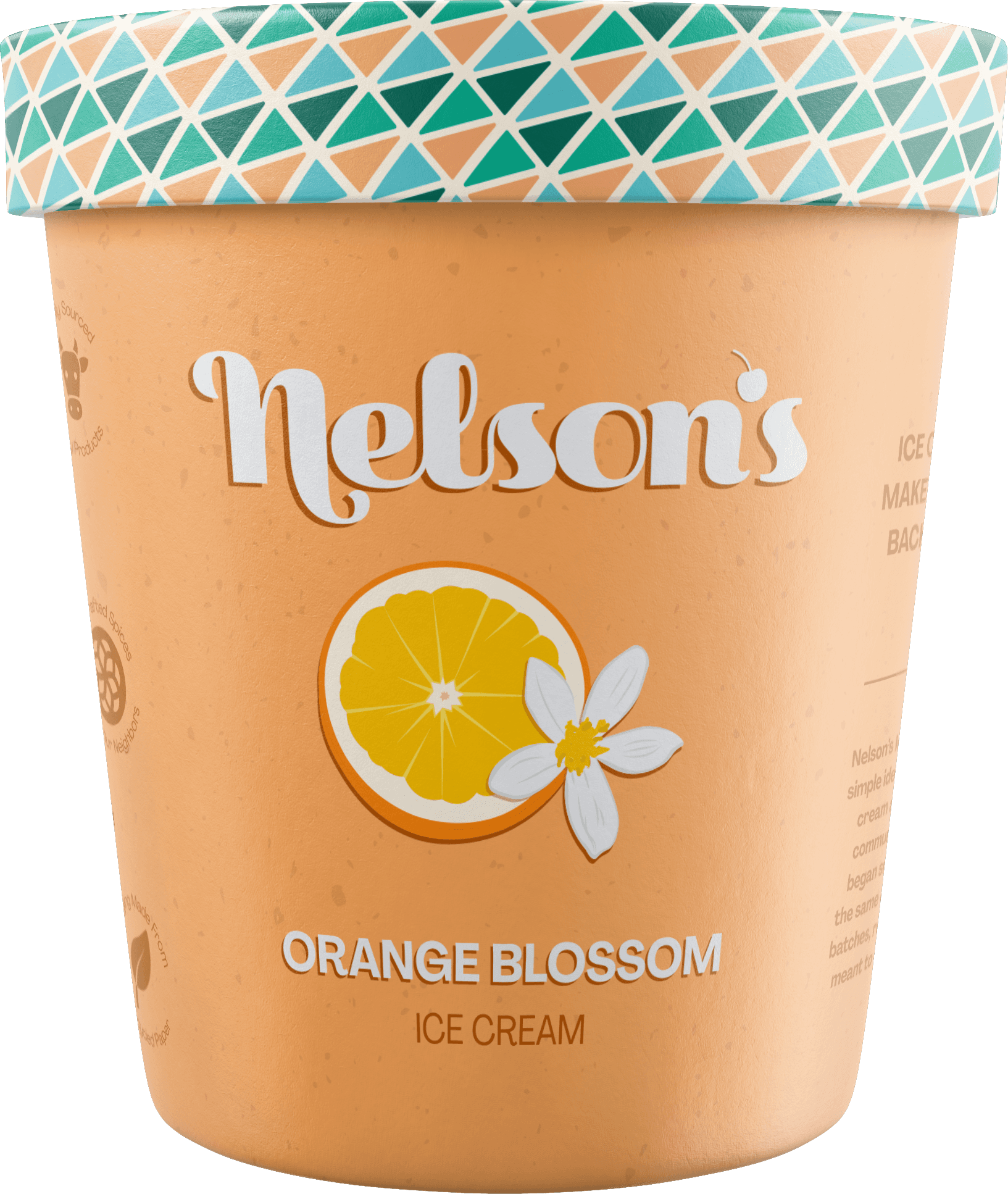
Package design
Enviornmental Design
2025
Nelson’s Ice Cream is a reimagined identity for a Portland-based ice cream brand, designed to evolve from a local food truck into a scalable, multi-location brick and mortar experience.
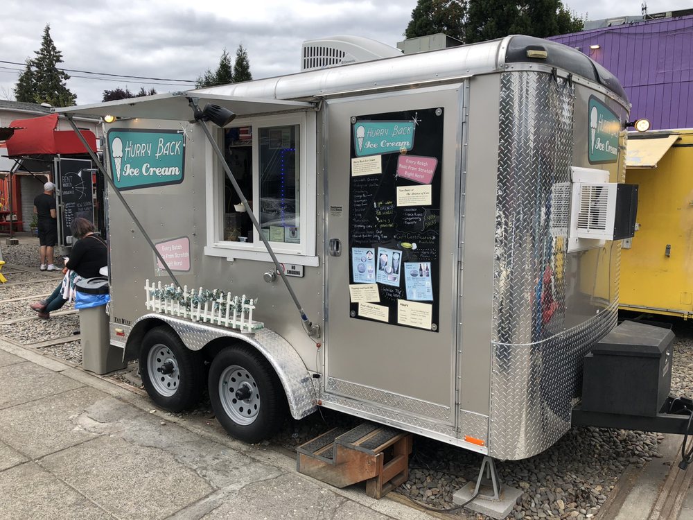
Brand History
Originally operating as Hurry Back Ice Cream, the brand had a loyal local presence but lacked a cohesive identity system and the flexibility needed to scale beyond a food truck.

Opportunity
While Hurry Back Ice Cream had a recognizable presence, its identity wasn’t built as a scalable system. It worked for a single food truck, but couldn't be used across storefronts, packaging, or future expansion. The goal was to create a more consistent identity while maintaining the approachable feel that made the brand successful.
Strategy
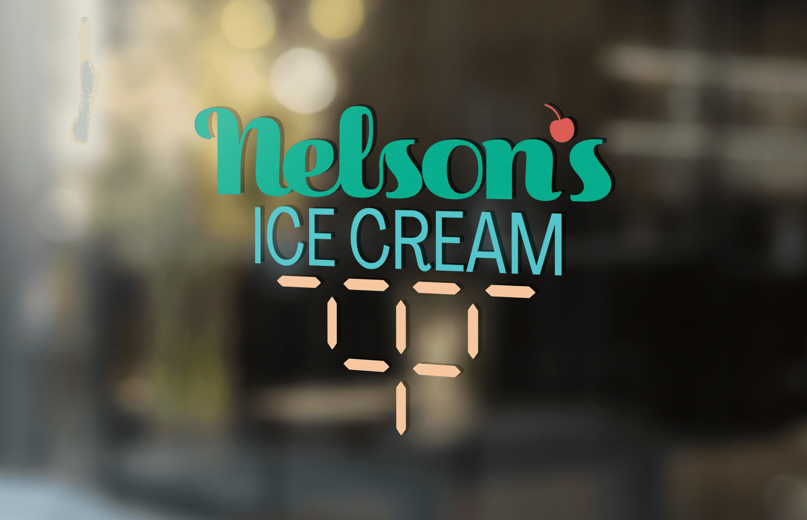
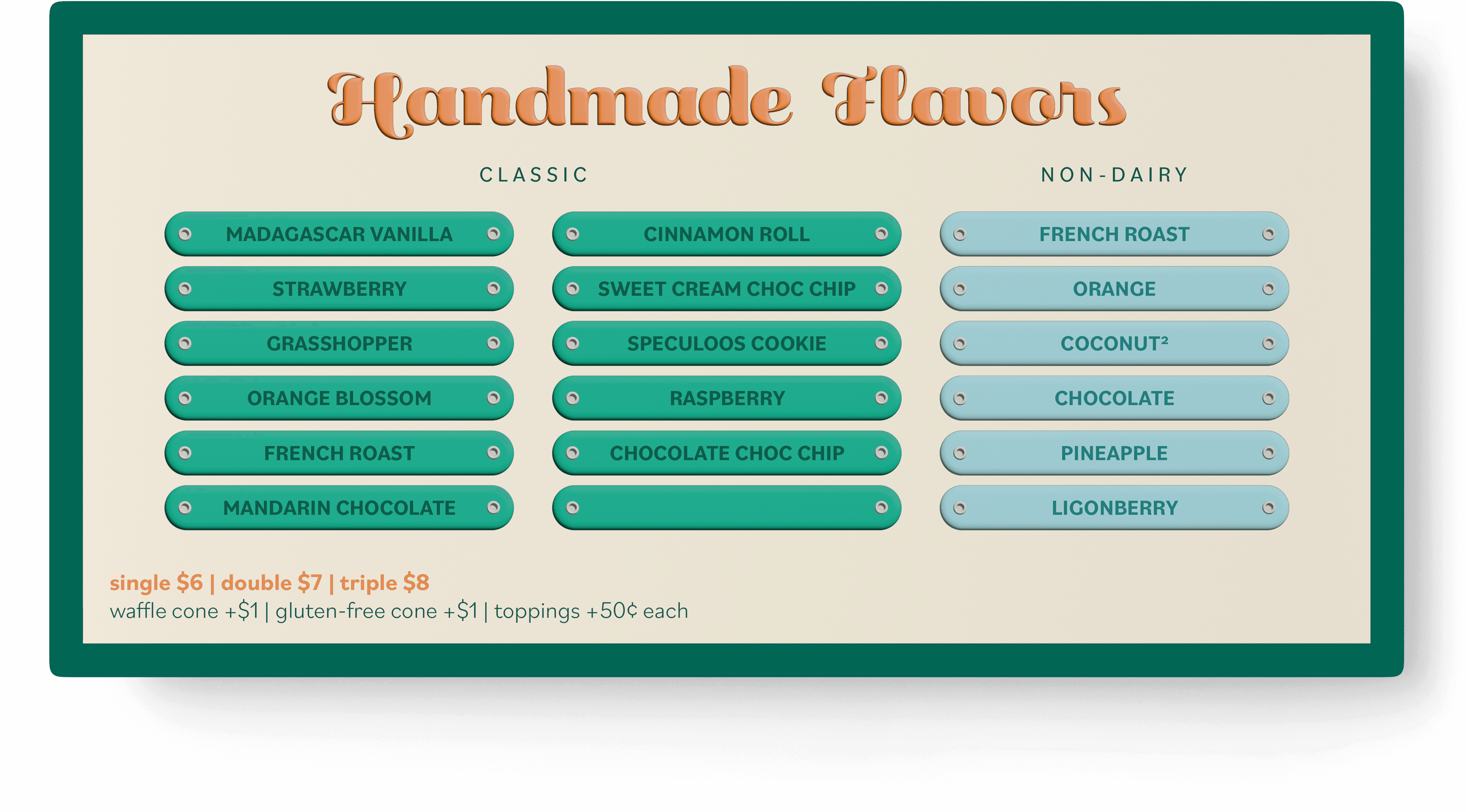
The rebrand introduces Nelson’s Ice Cream, a more personal and timeless identity built for growth. The visual direction balances modern clarity with subtle retro influence, drawing from mid-century aesthetics, creating a brand that feels familiar, refined, and scalable.

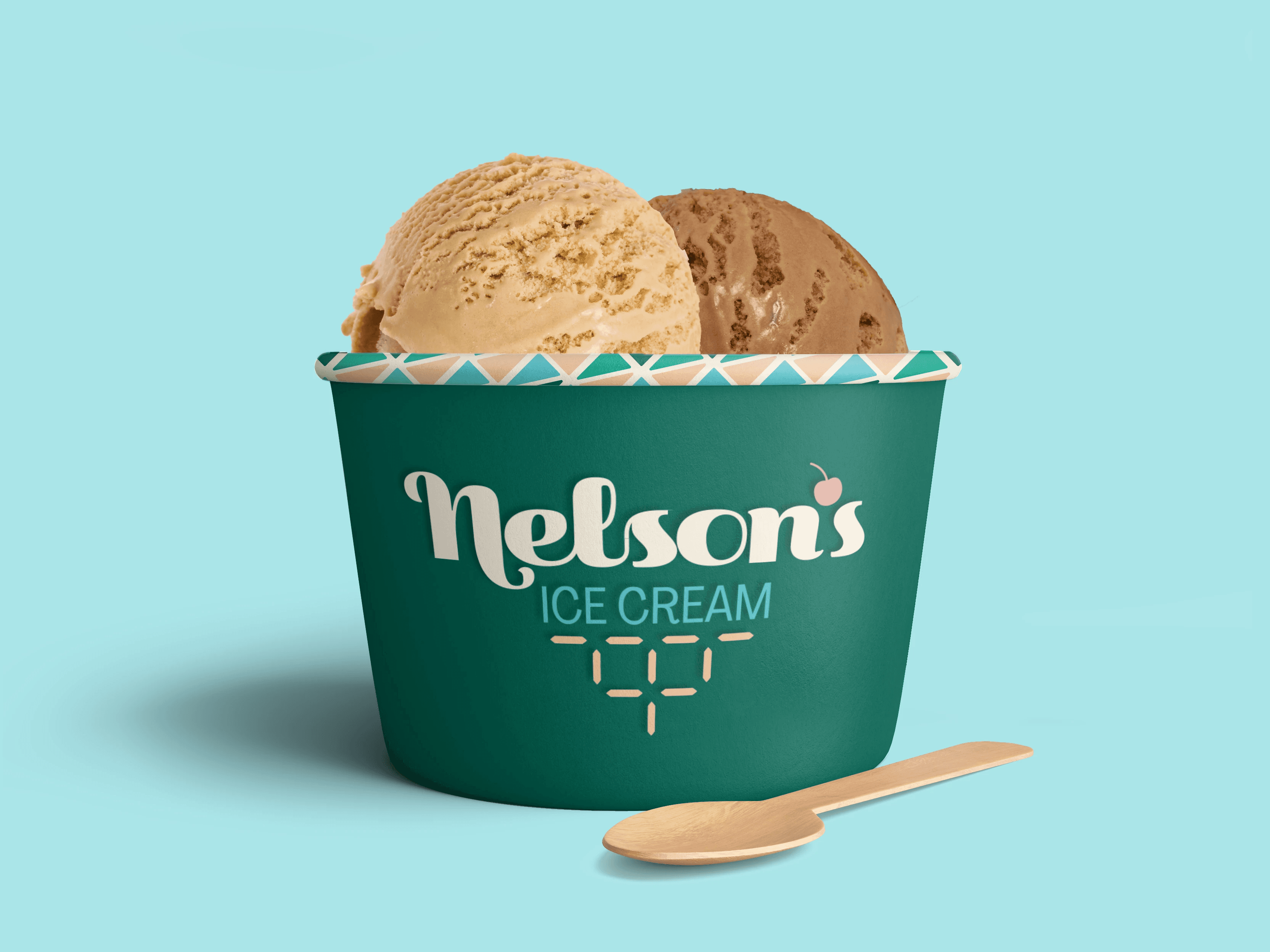
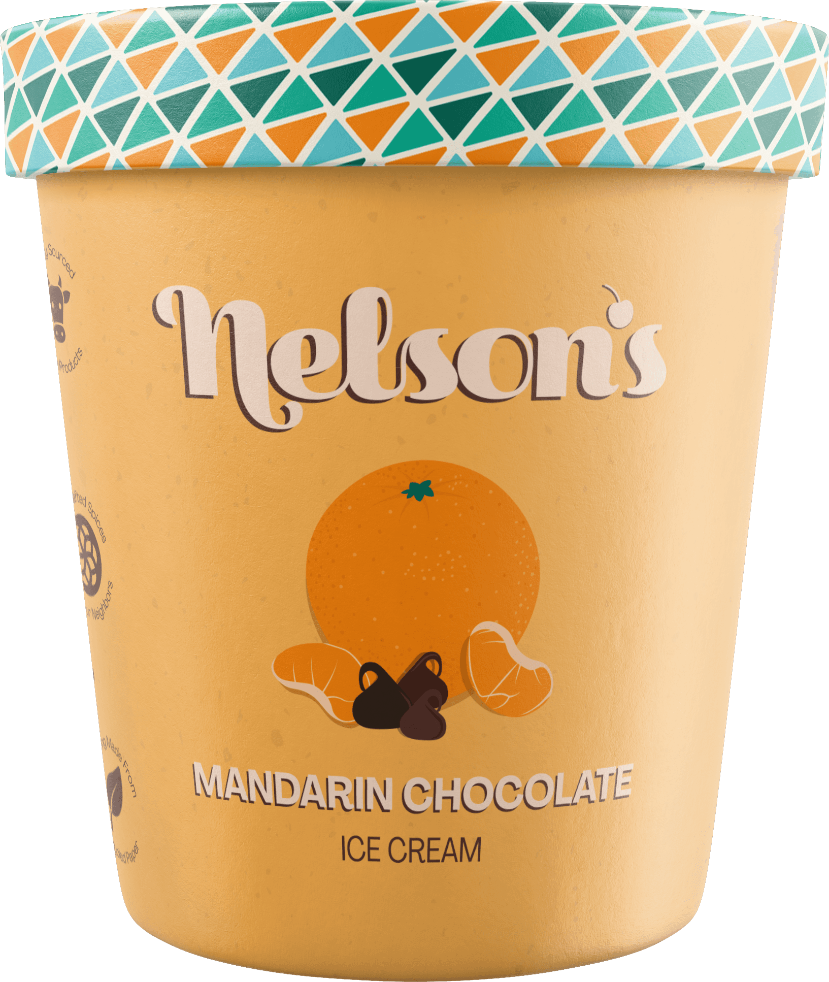
Visual identity
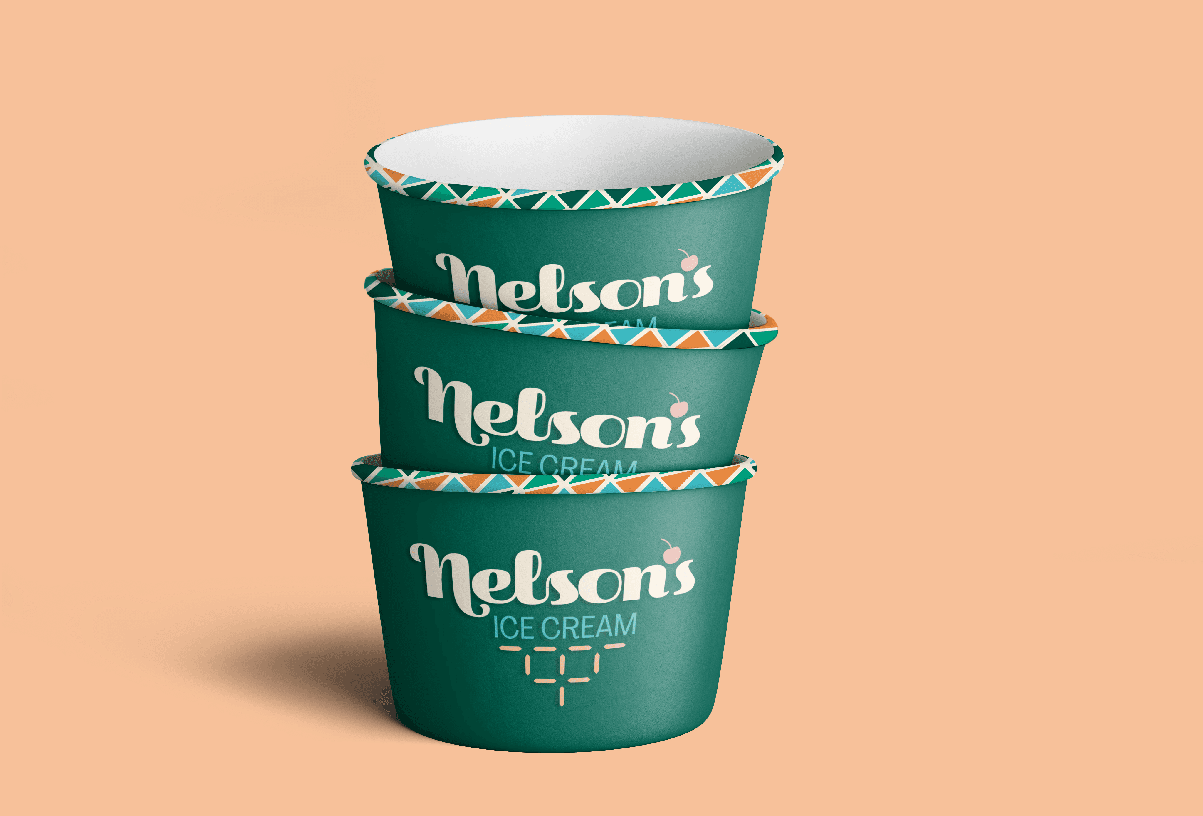
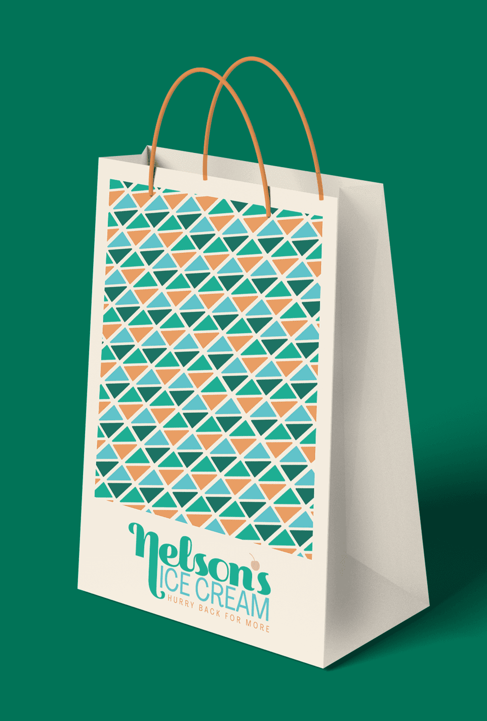
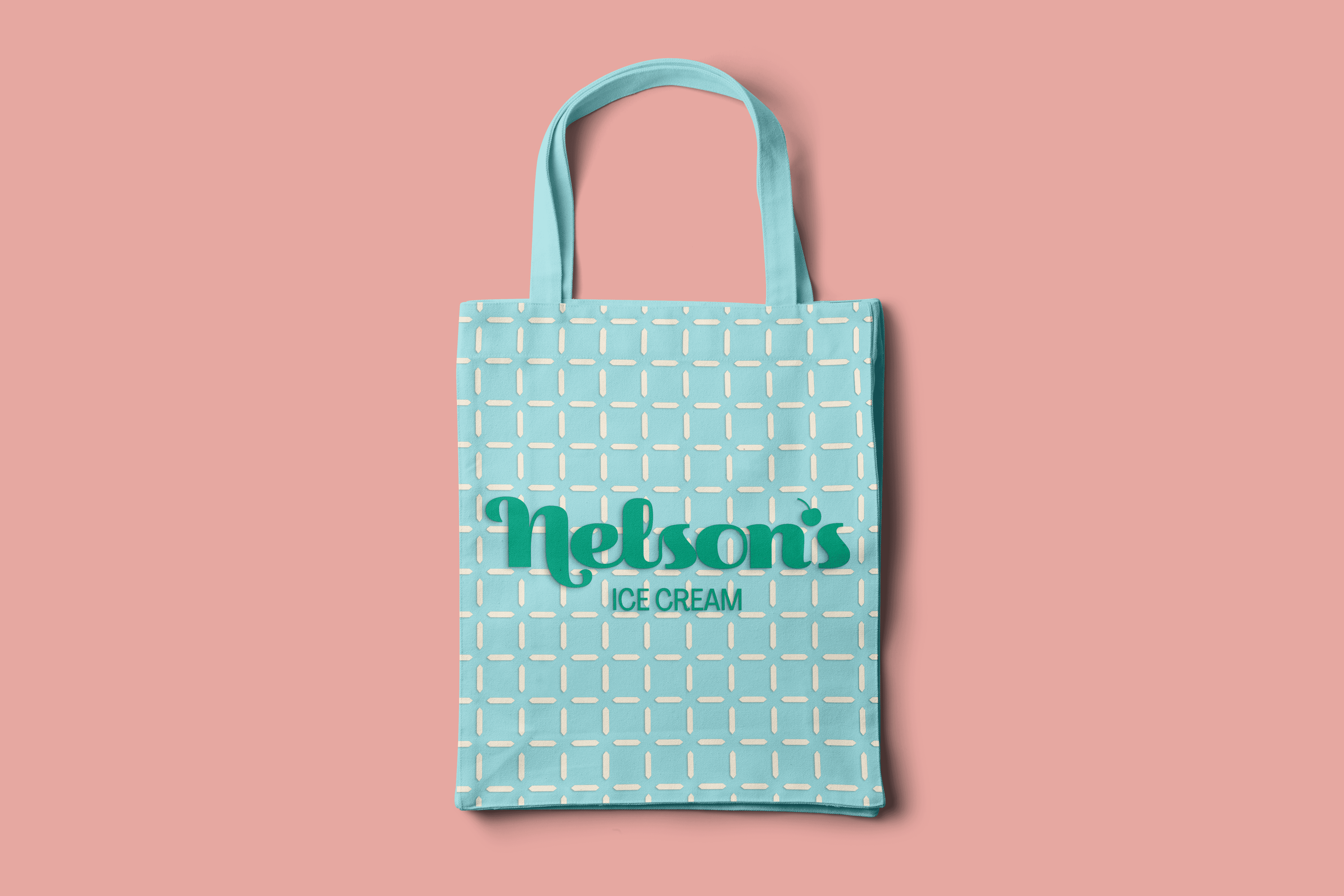
The logo features a custom wordmark with soft curves and personality. The cherry and cone patterns are subtle hints to ice cream.

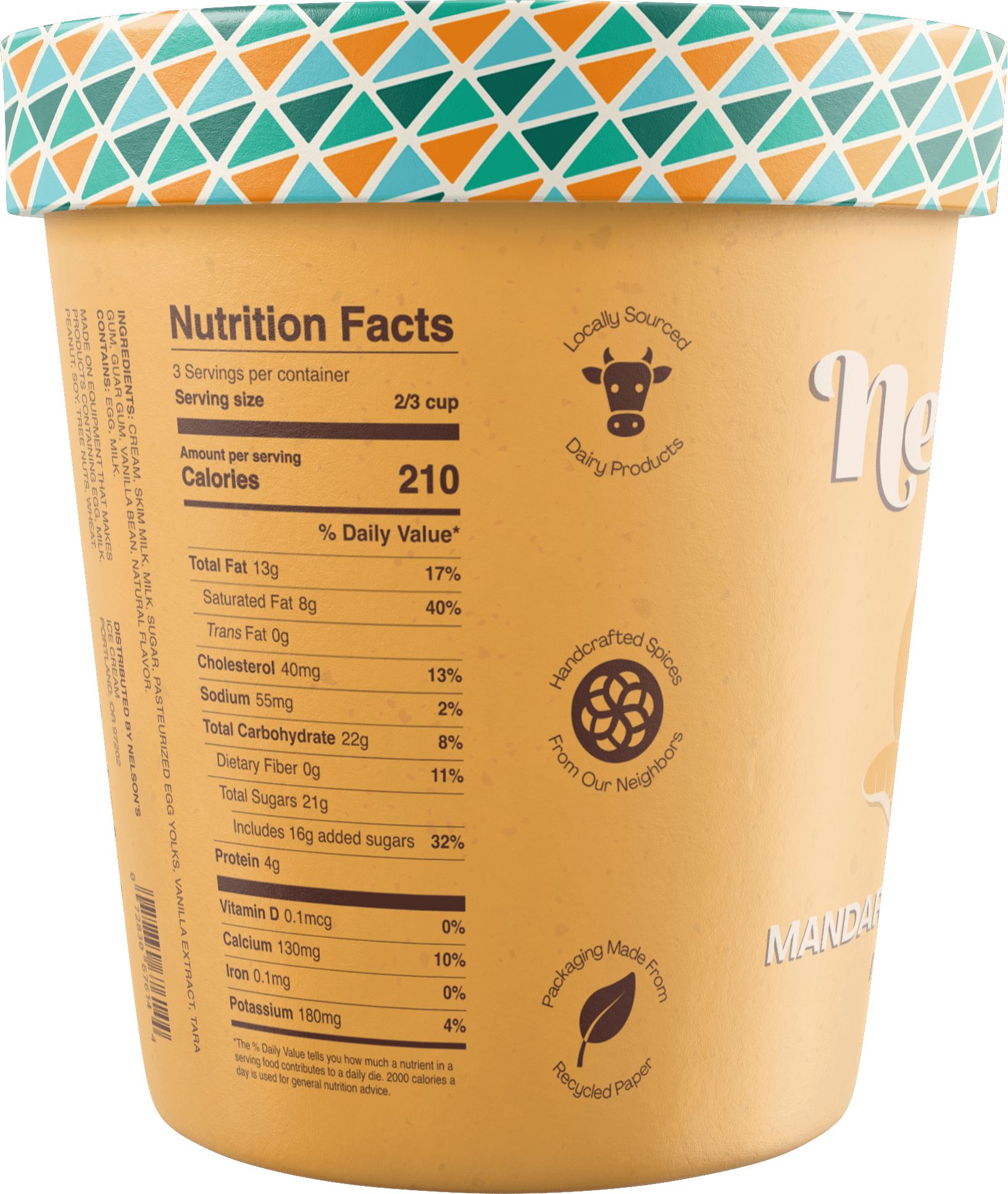
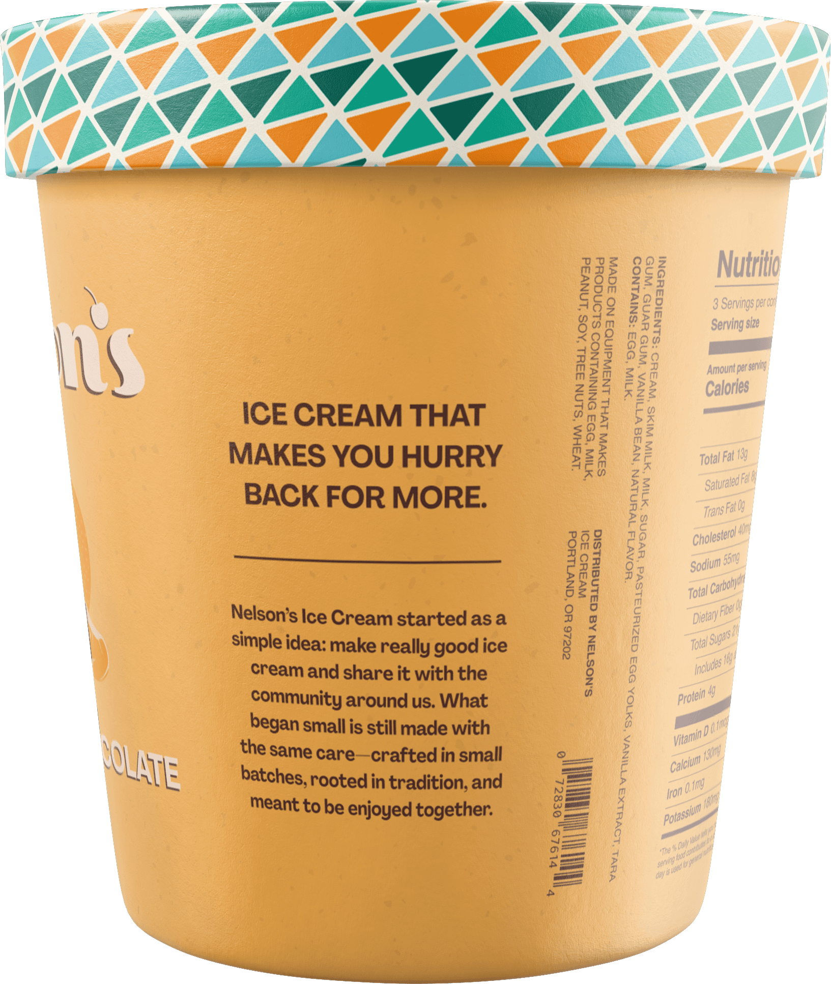
Packaging


Brand in use


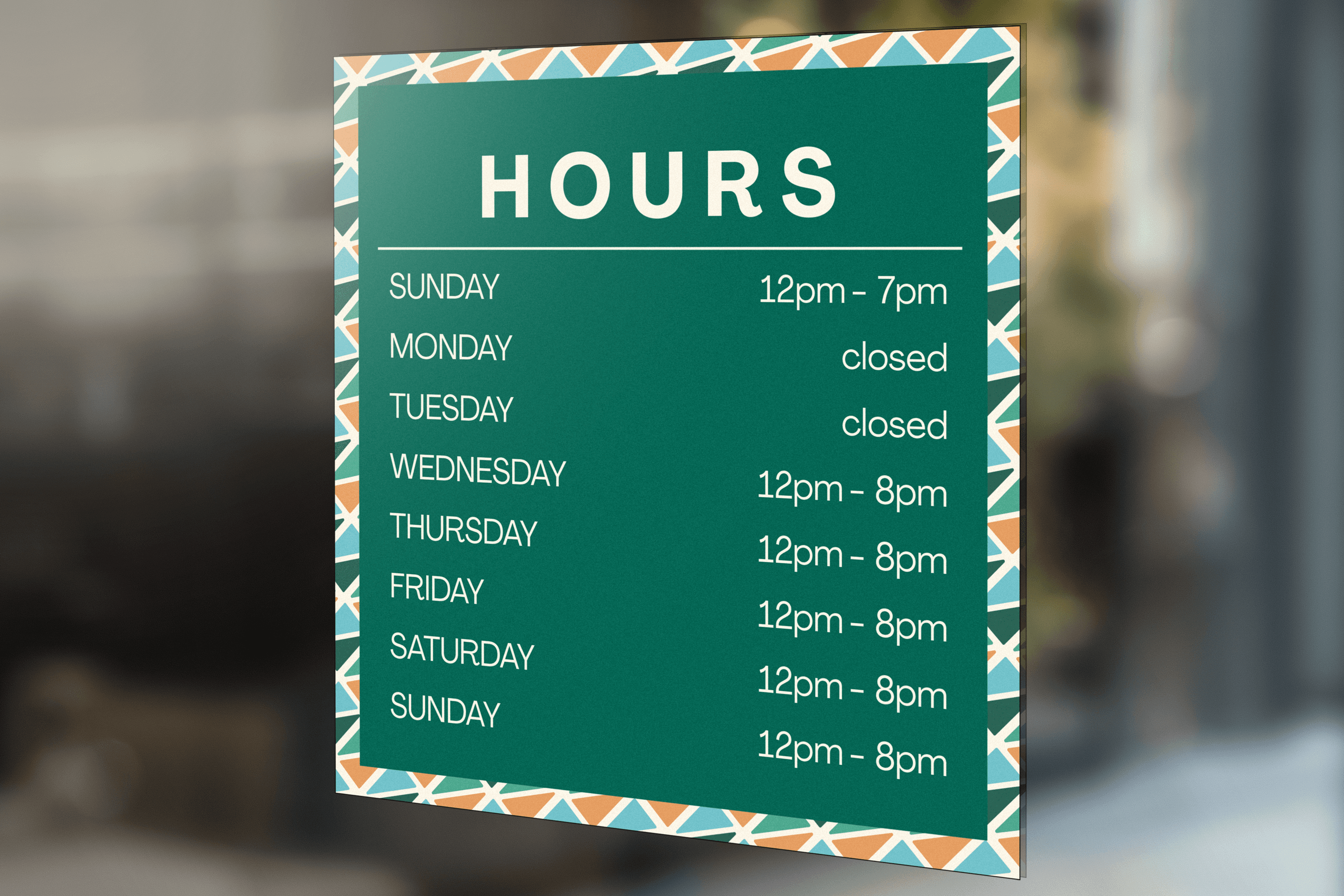

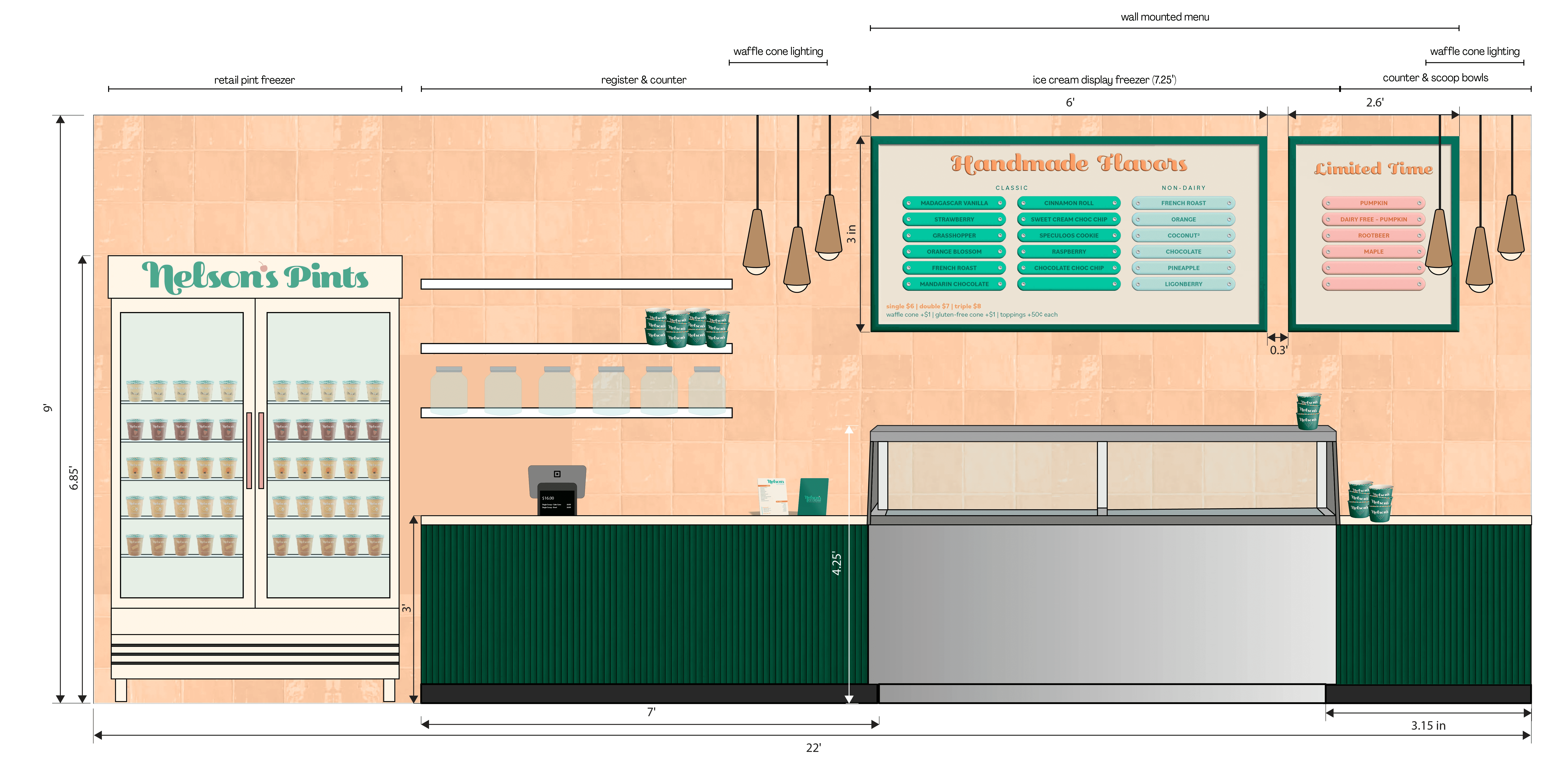
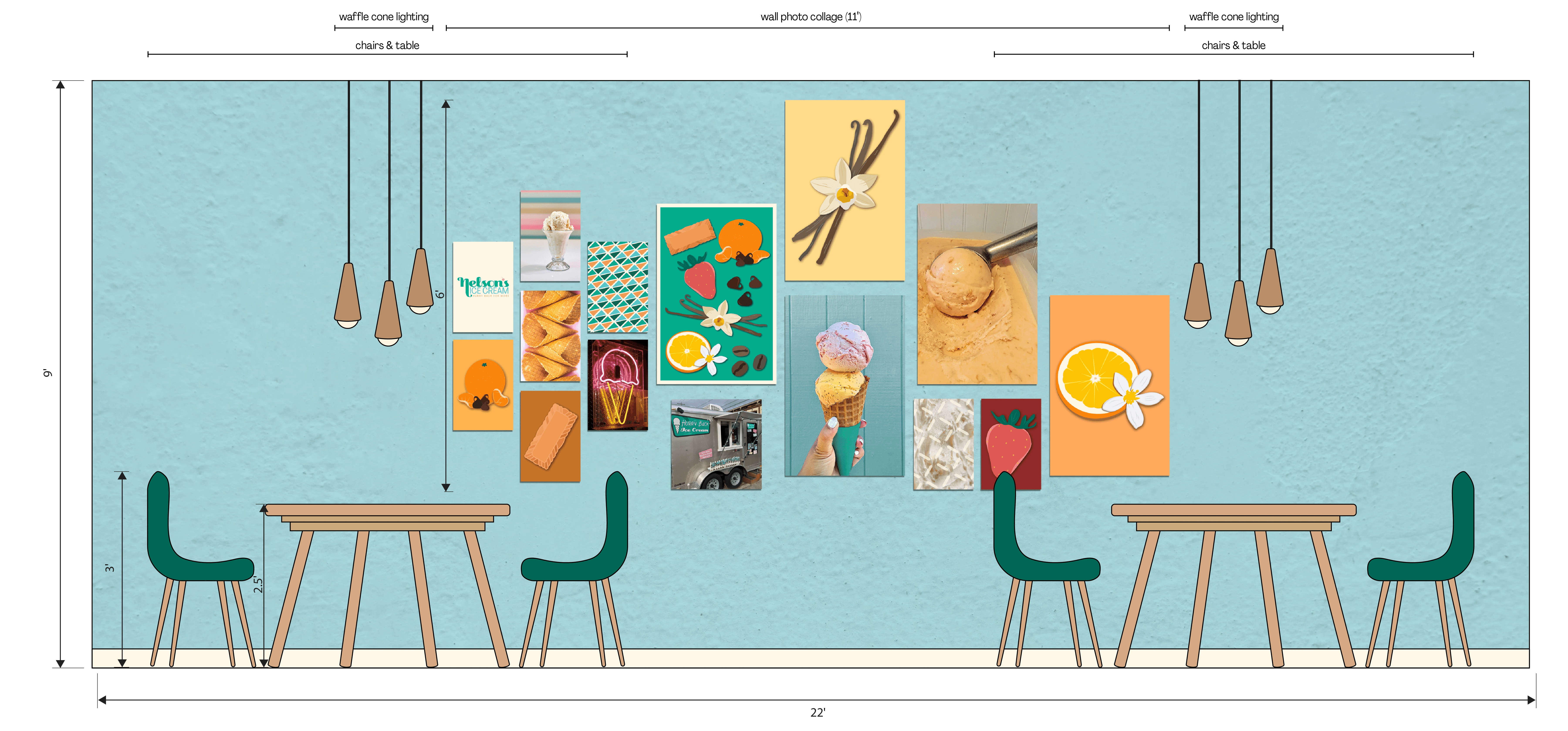
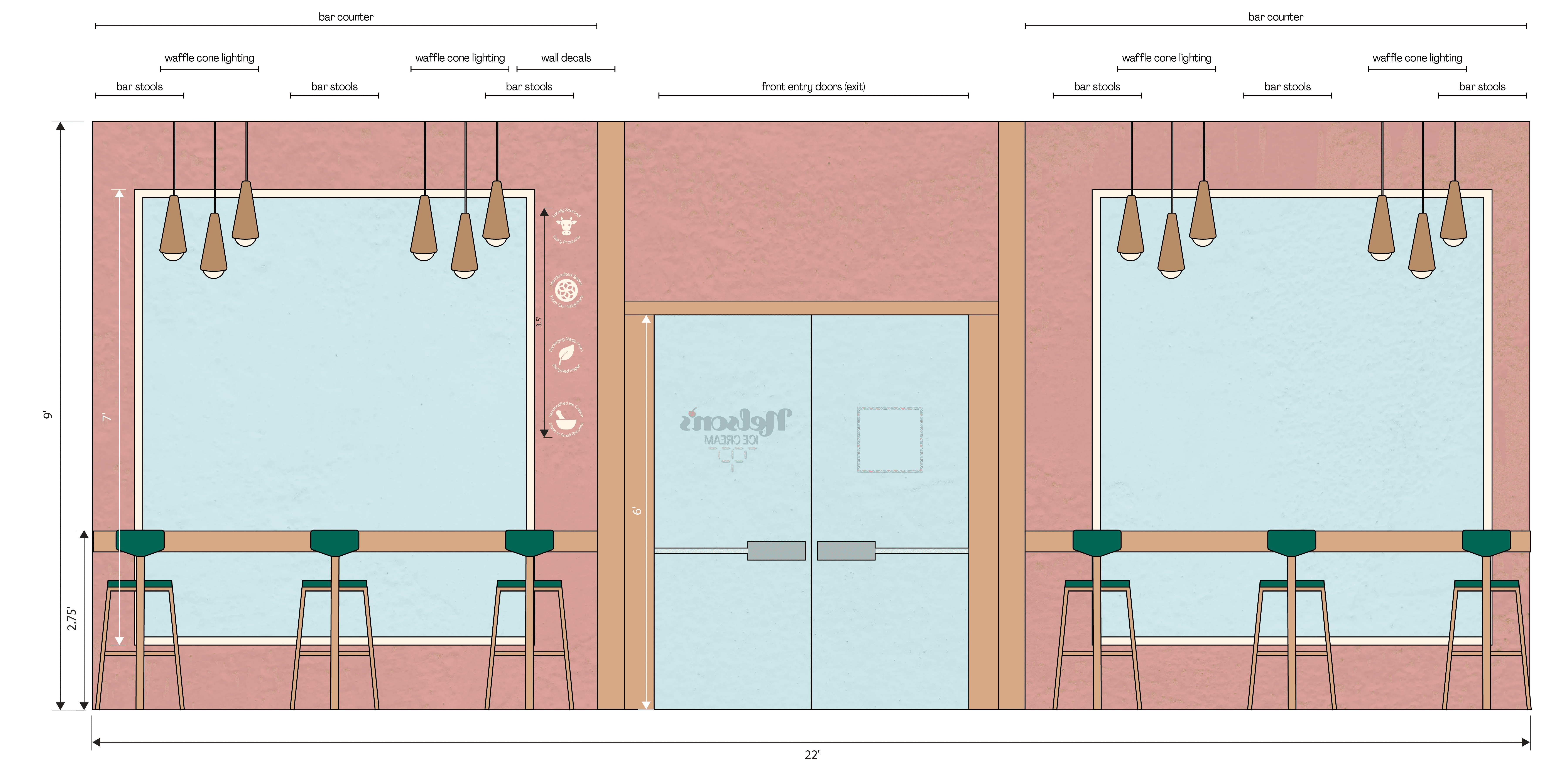
Interior Design