Oregon Art Beat Rebrand
Branding
Motion Graphics
2025
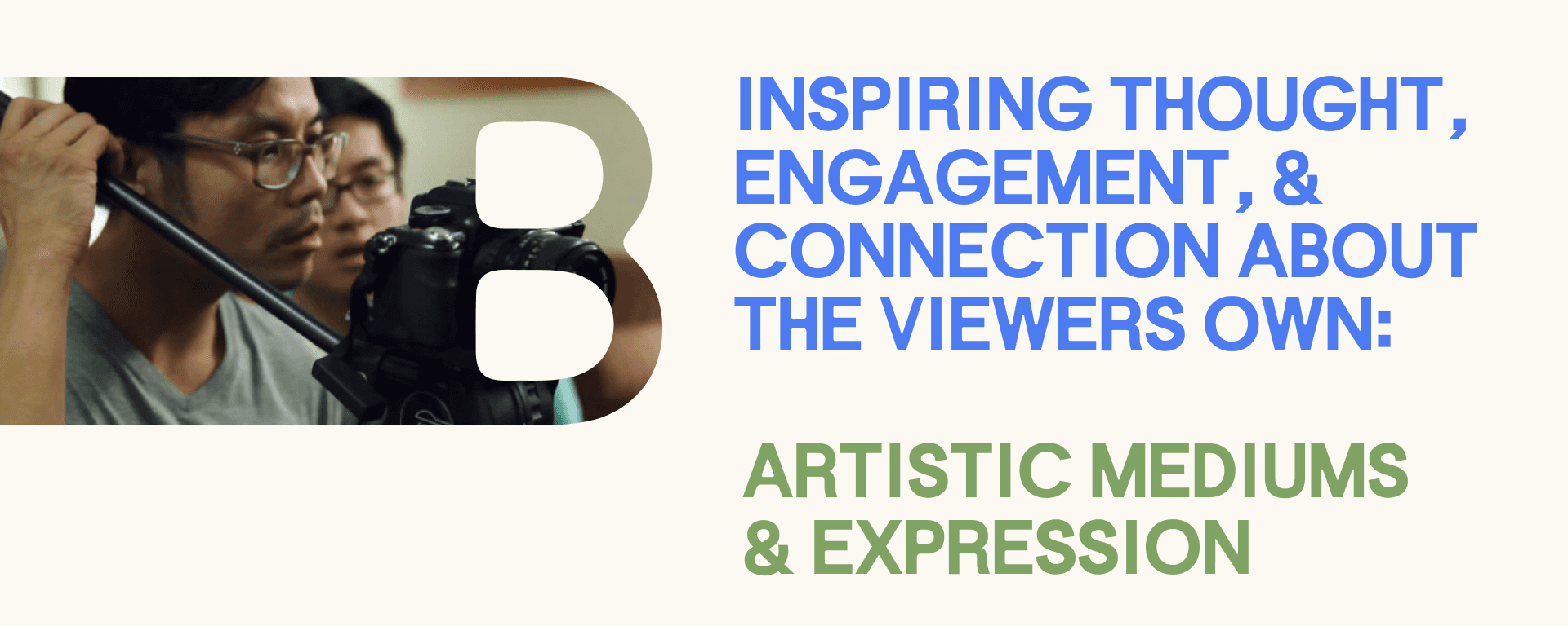
This project is a conceptual rebrand of Oregon Art Beat, an Emmy-winning television series by Oregon Public Broadcasting that highlights artists and creative communities across the Pacific Northwest. The goal was to evolve the brand into a more modern, flexible system that better translates across digital, social, and broadcast platforms. The rebrand focuses on making the show feel more engaging, accessible, and reflective of the energy and diversity of the artists it features.

Brand History
Since its premiere in 1999, Oregon Art Beat has showcased a wide range of artists, cultural stories, and creative practices across Oregon. Originally developed by Jeff Douglas and later led by producer Jessica Martin, the program has built a strong reputation for thoughtful storytelling and high-quality production.
While the content remains rich and community-focused, the visual identity has not evolved at the same pace as the platforms it now lives on.
Opportunity
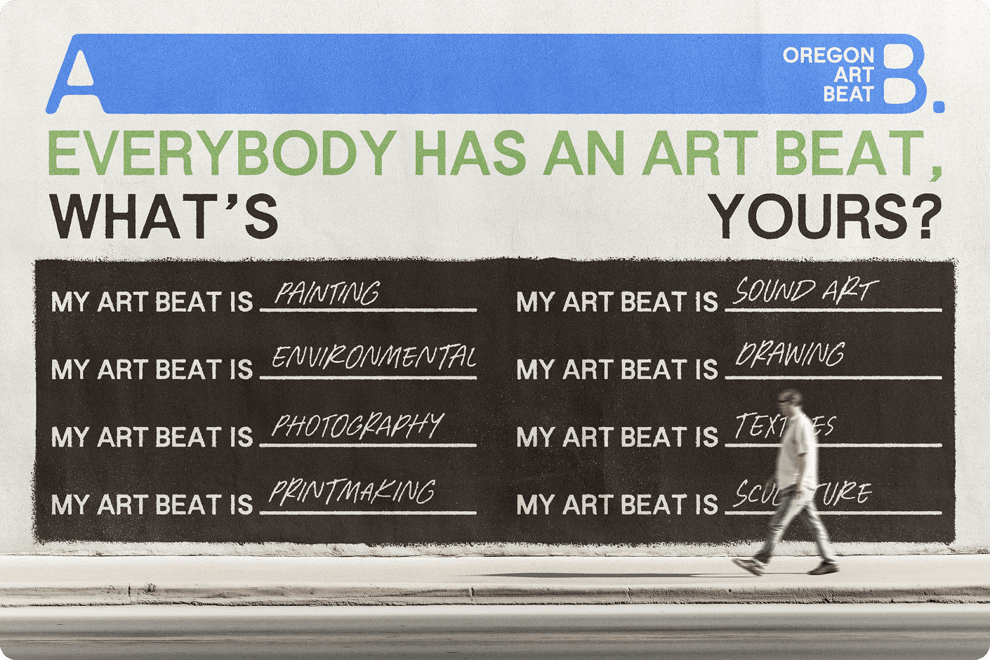
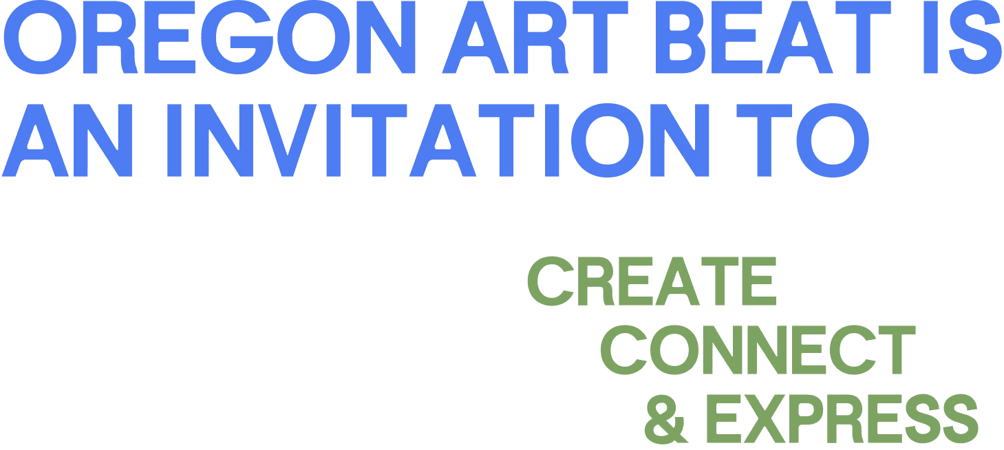
Oregon Art Beat has a strong foundation and loyal audience, but its current brand feels tied to a traditional broadcast format. The opportunity was to create a more dynamic and adaptable identity that reflects the movement, diversity, and personality of the arts community it represents.
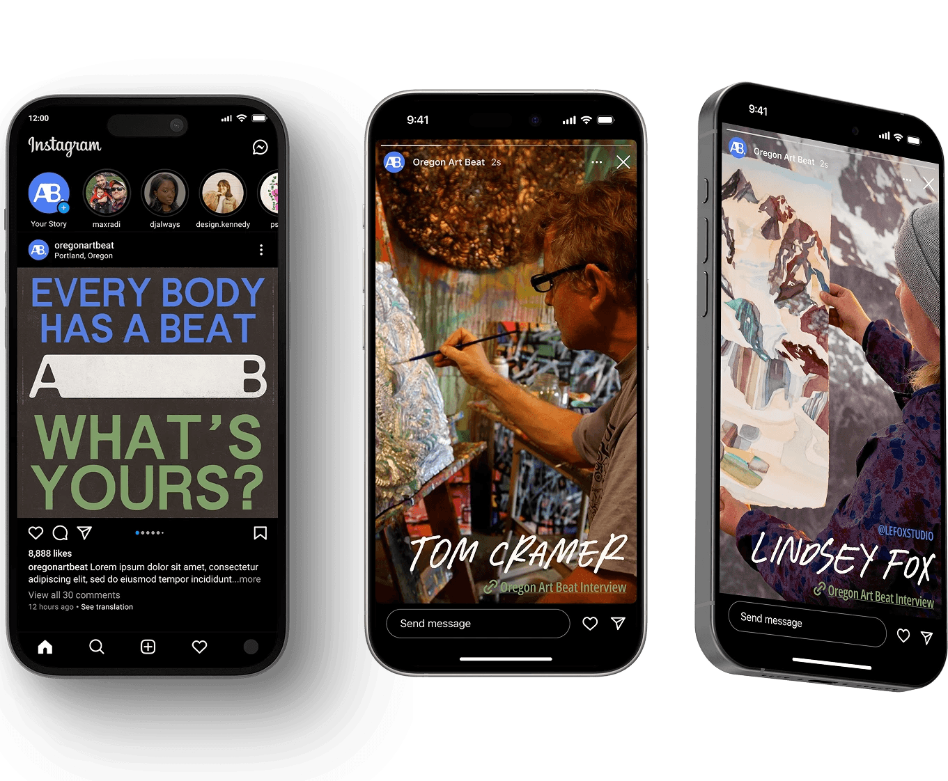
With growing presence on platforms like YouTube and Instagram, there is also a need for a system that translates effectively across digital spaces while appealing to a younger audience.

Strategy
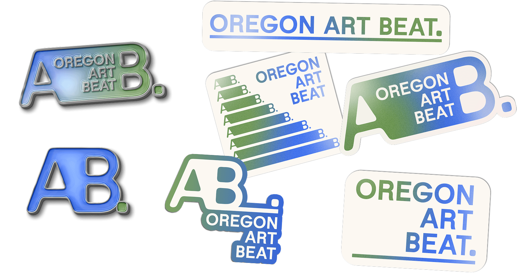
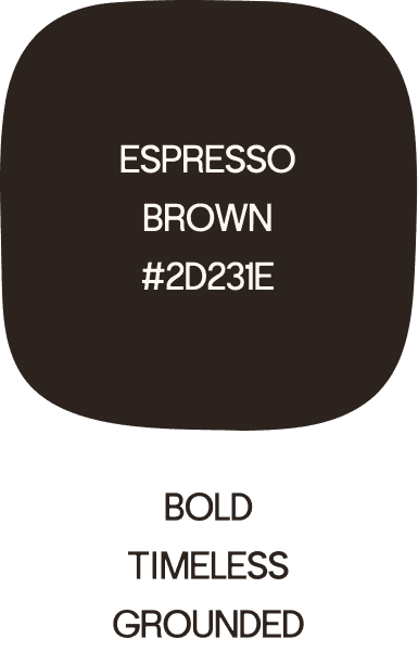
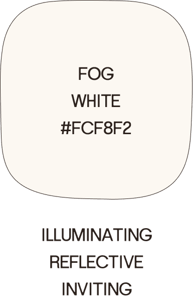
Visual identity
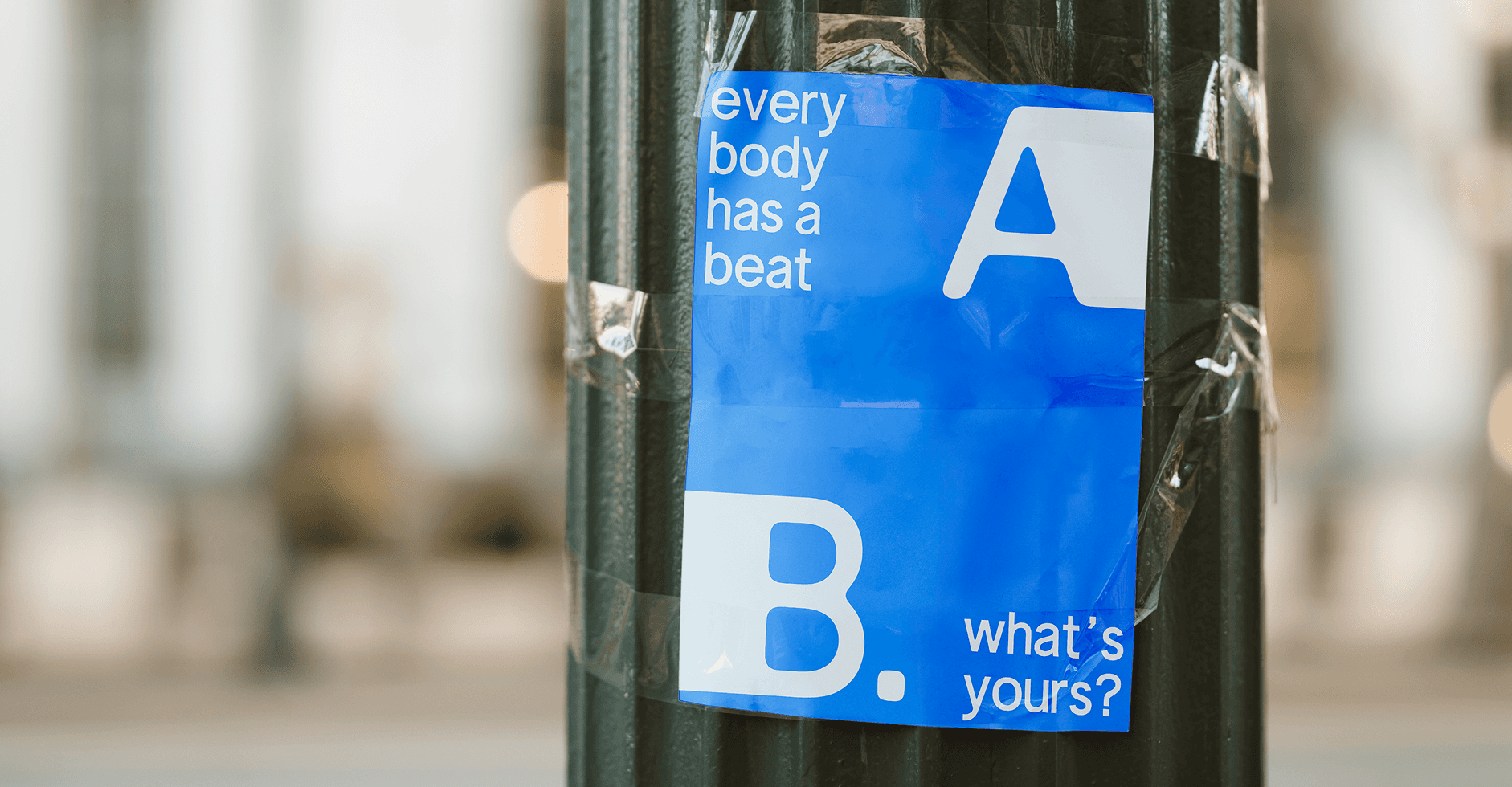
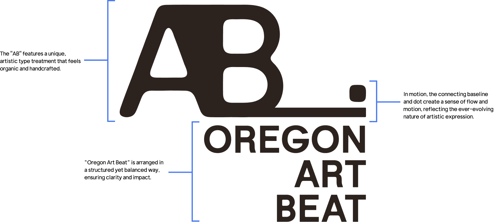
The visual identity is built to express movement, rhythm, and personality—mirroring the creative process itself.

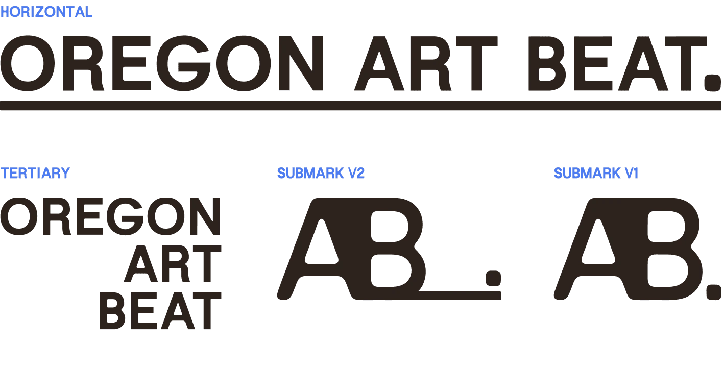


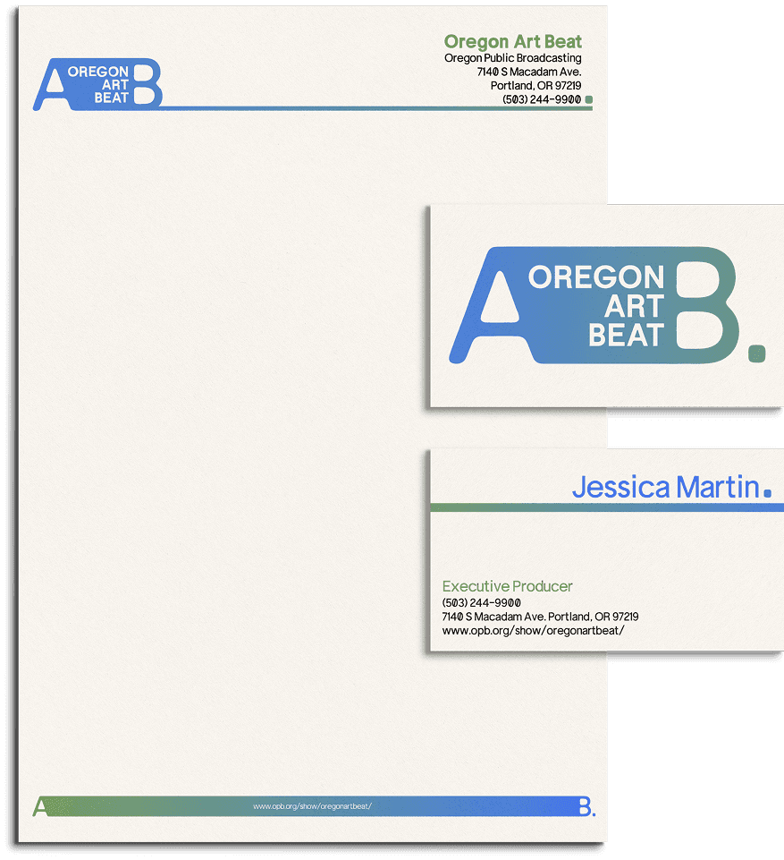
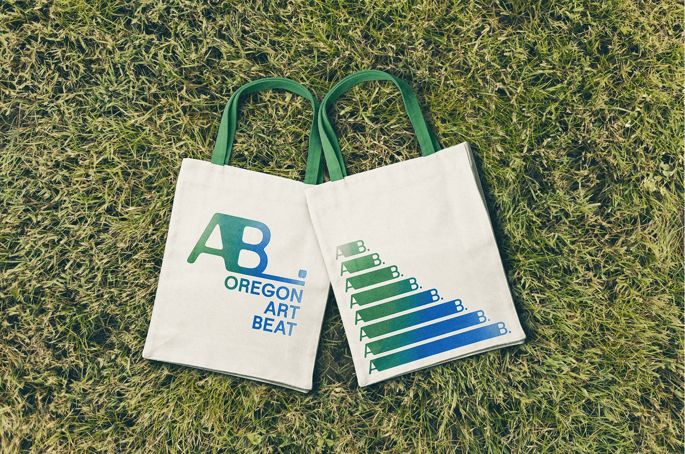
Brand in use
The system extends across motion, digital, and physical applications—ensuring consistency while allowing flexibility across broadcast graphics, social media, and branded materials.