Whimsi
Package Design
Branding
2025
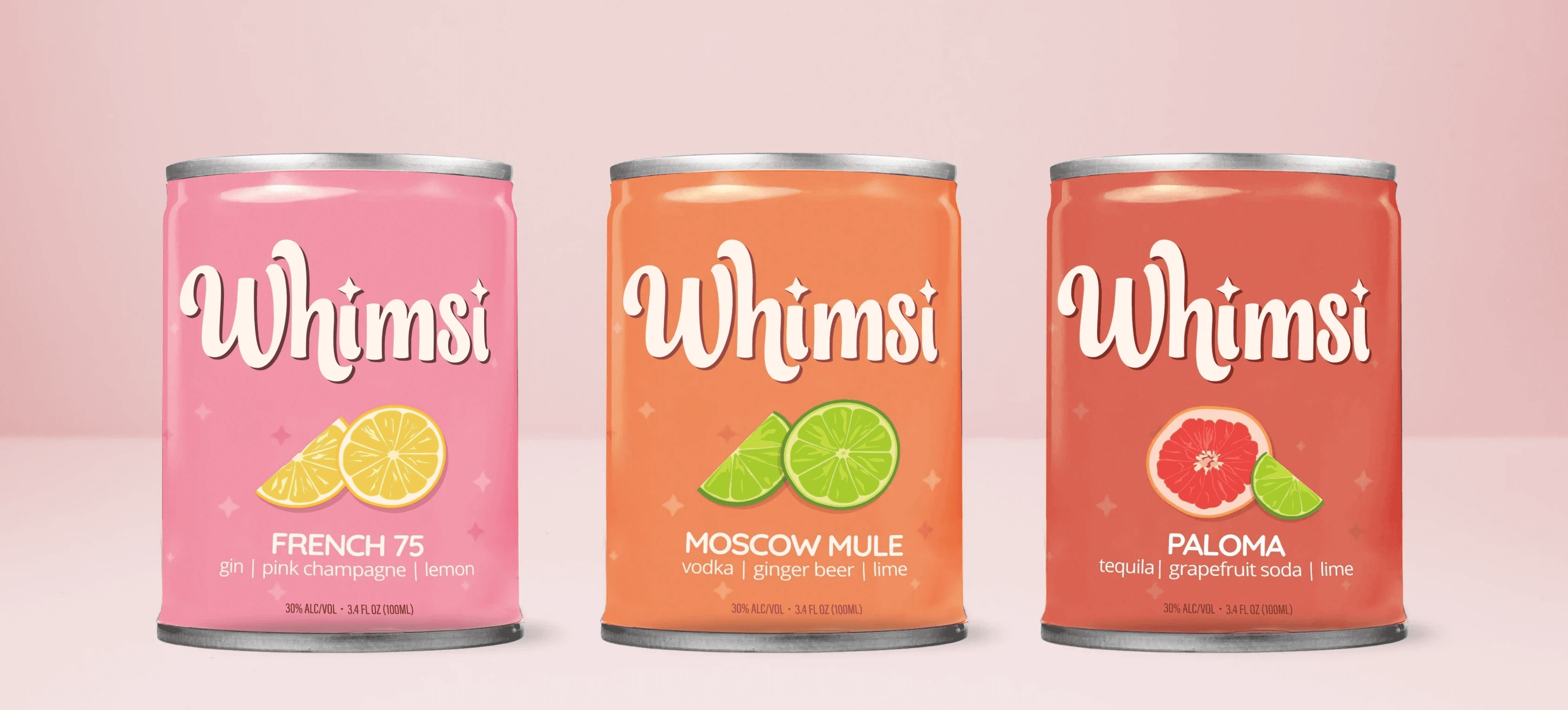
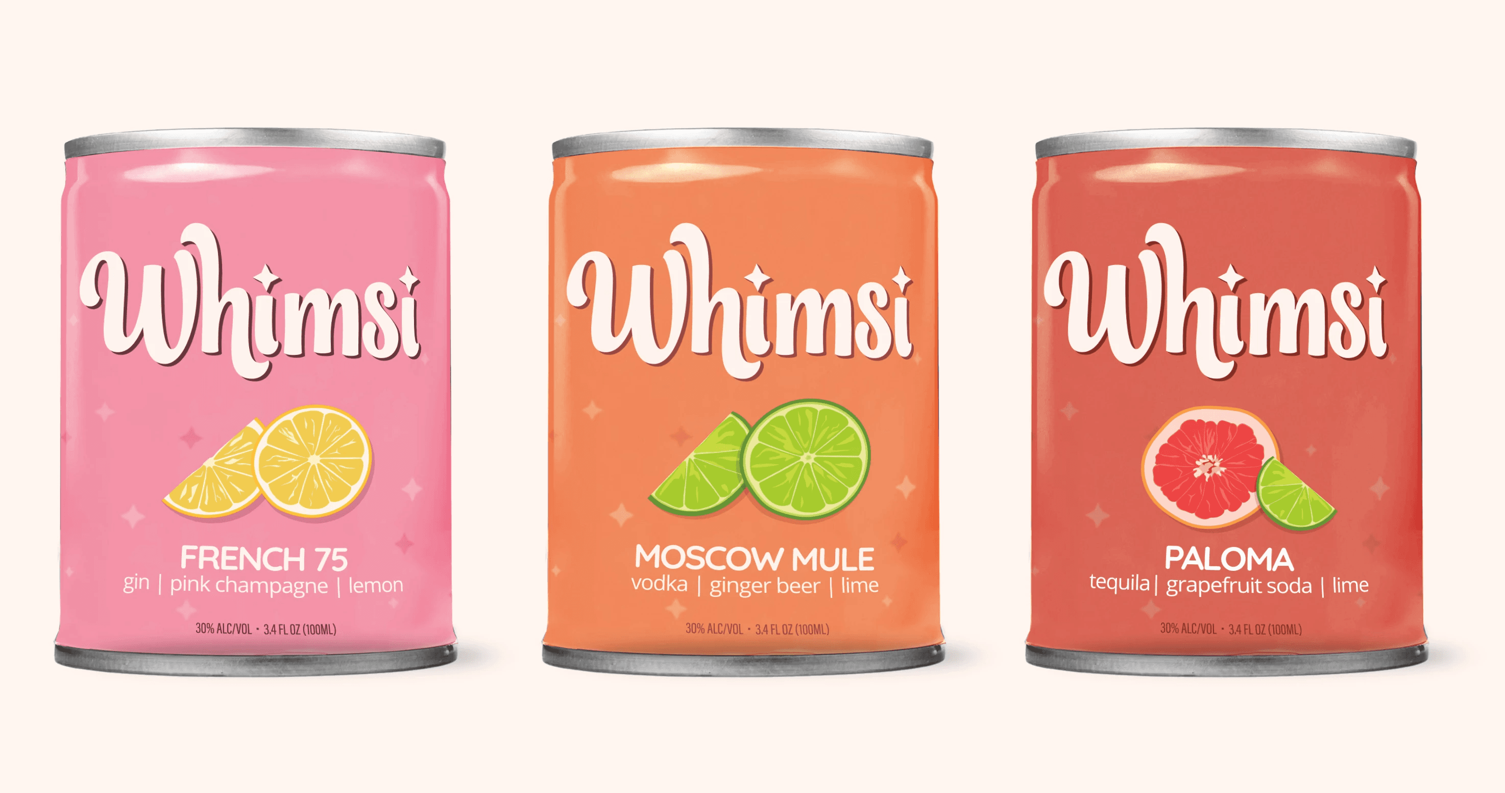
Whimsi is a collection of canned cocktails that marries convenience with sophistication. With vibrant visuals and an approachable design, Whimsi promises consumers a delightful experience in every sip.
Project Overview
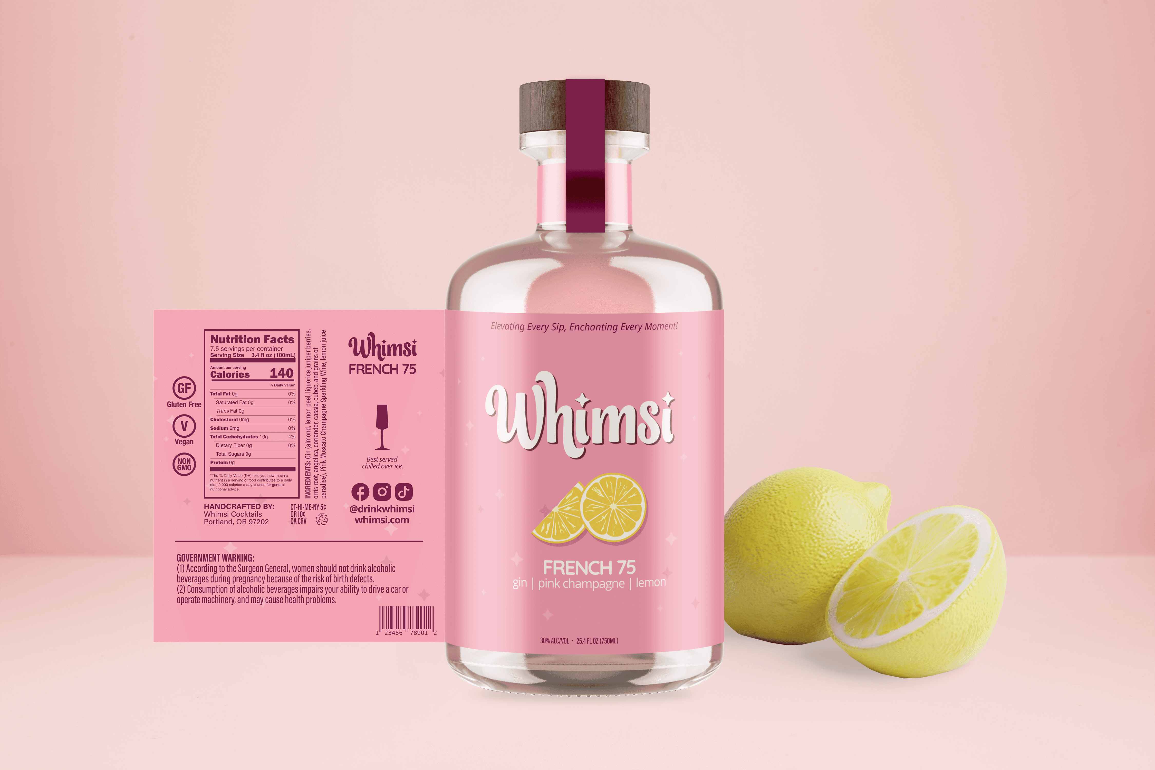
Whimsi is a ready-to-drink cocktail brand designed to feel elevated yet approachable. The goal was to create a system that balances playful, fruit-forward energy with a sense of polish and sophistication. The brand extends across multiple formats, including canned cocktails and pre-mixed bottled offerings, creating a cohesive yet flexible identity system.
Concept
The concept behind Whimsi is “elevated play” in the convenience of a pre-mixed drink for any occasion.
The brand pairs light, whimsical visual elements—sparkles, fruit illustrations, soft gradients—with structured typography and clean layouts. This contrast allows the brand to feel fun without losing credibility.

Visual identity
The logo features a customer wordmark with soft curves and personality. The subtle star element reinforces the "whimsi" concept.
Primary Workmark - B/W

Primary Workmark - Color

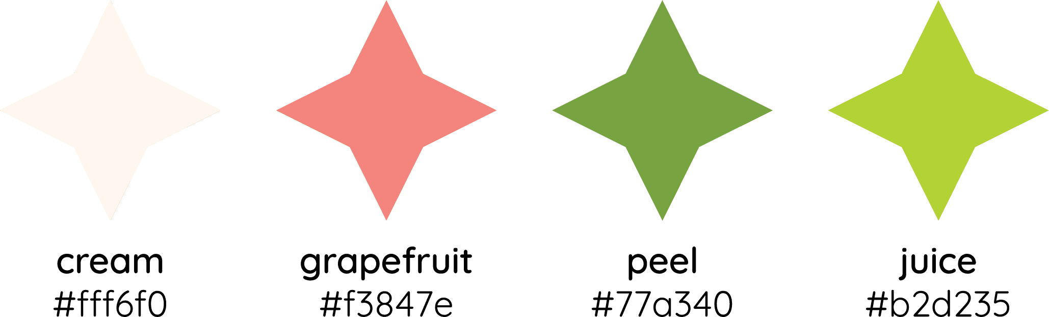
Brand Colors

opportunity
Most canned cocktail brands lean in one of two directions: overly masculine and minimal, or overly sugary and cheap. There is an opportunity for a brand that feels playful and expressive without sacrificing taste perception or quality.
Whimsi explores bringing personality, color, and charm into a space that still feels refined and intentional.