Nelson’s Ice Cream
Branding
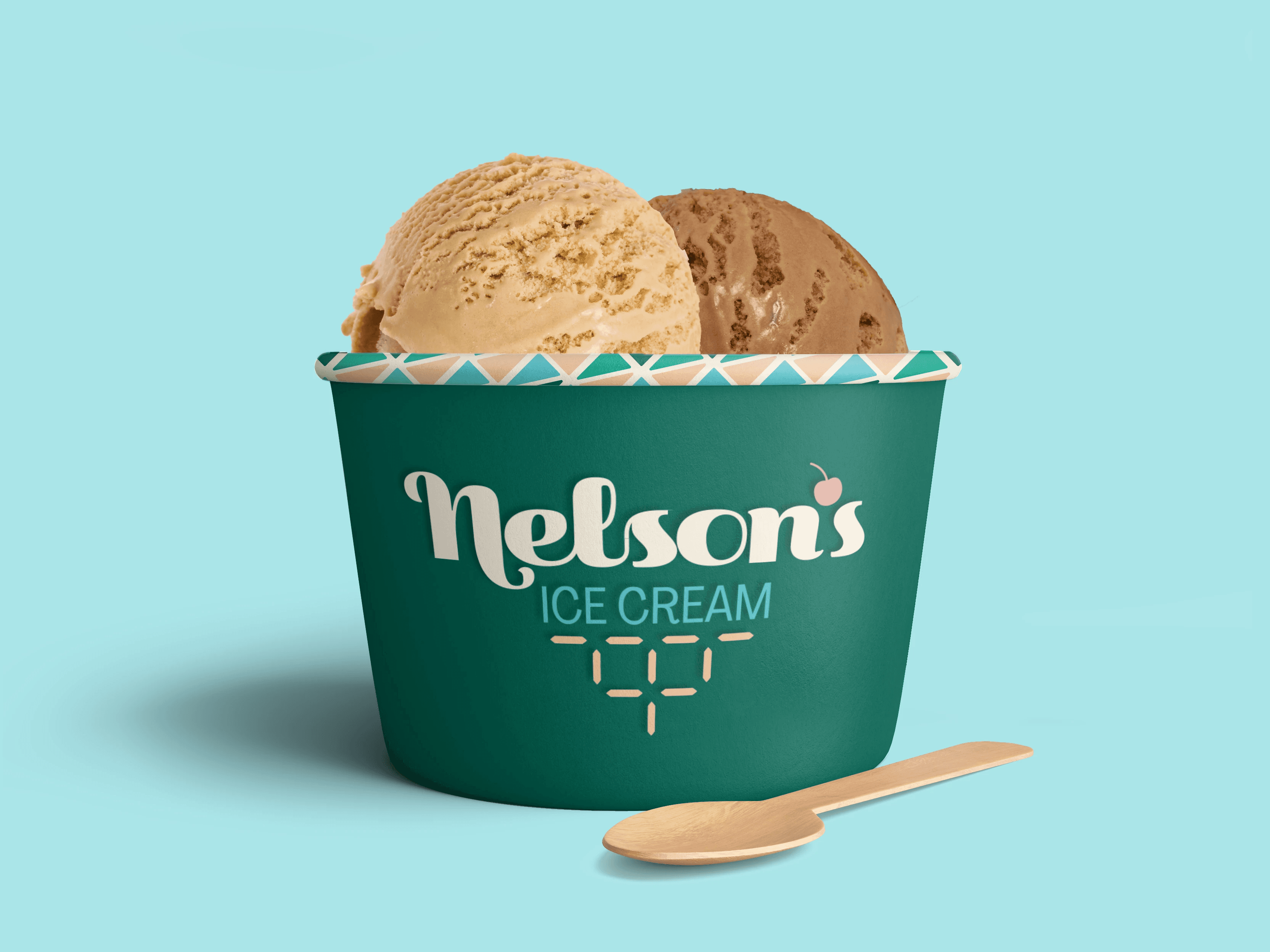
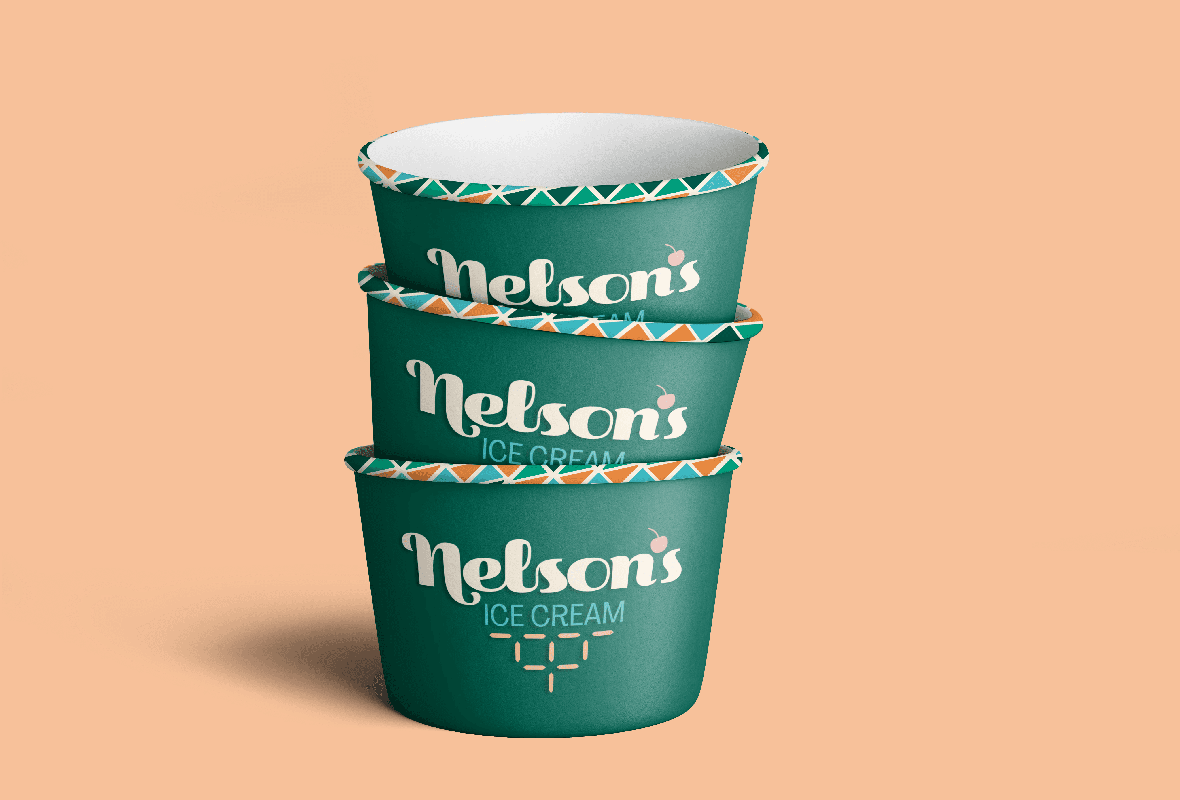
Packaging design
Environmental Design
2025
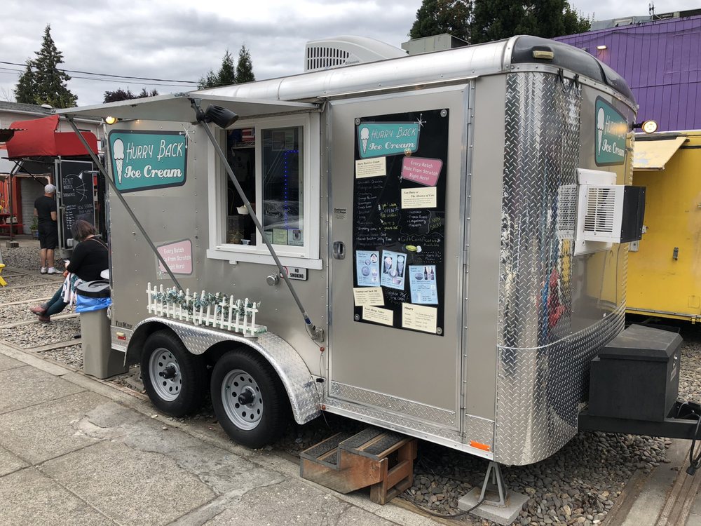
Nelson’s Ice Cream is a hypothetical rebrand for a Portland-based ice cream food truck, Hurry Back Ice Cream. This project explores how a brand system can help a small business grow into a brick-and-mortar location and sell products in retail stores.
Additional project details and brand guidelines are available upon request.

Brand History
Originally operating as Hurry Back Ice Cream, the brand had a loyal local presence but lacked a cohesive identity system and the flexibility needed to scale beyond a food truck.

Opportunity
While Hurry Back Ice Cream had a recognizable presence, its identity wasn’t built as a scalable system. It worked for a single food truck, but couldn't be used across storefronts, packaging, or future expansion. The goal was to create a more consistent identity while maintaining the approachable feel that made the brand successful.
Strategy
The rebrand introduces Nelson’s Ice Cream, a more personal and timeless identity built for growth. The visual direction balances modern clarity with subtle retro influence, drawing from mid-century aesthetics, creating a brand that feels familiar, refined, and scalable.
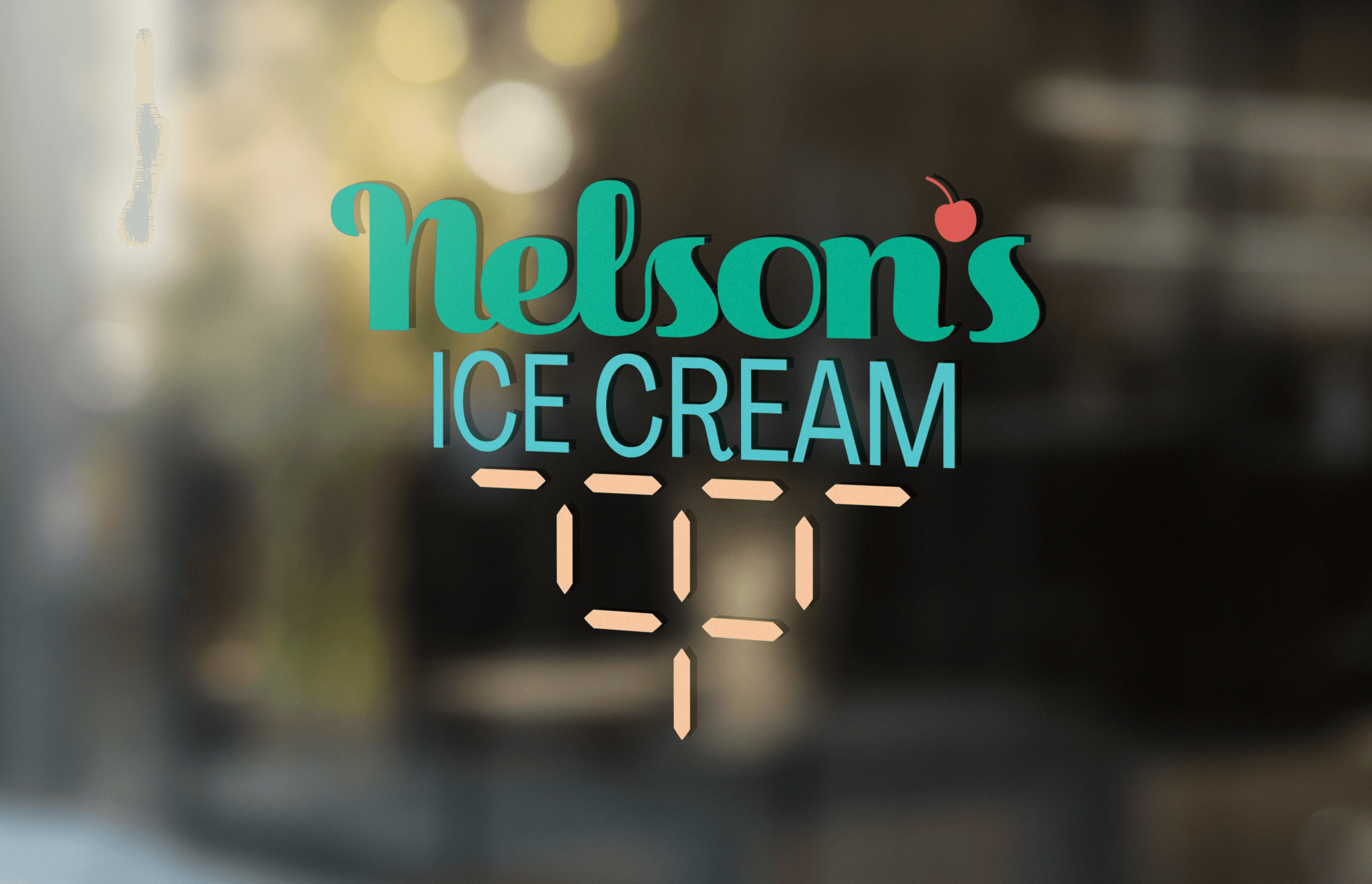
Visual identity
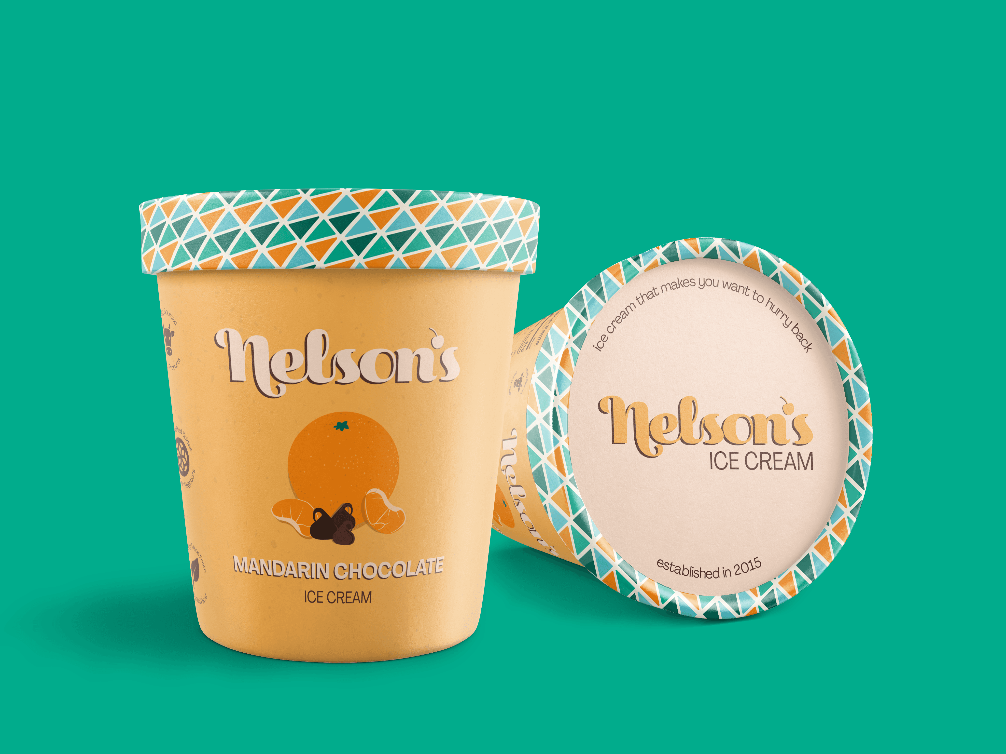
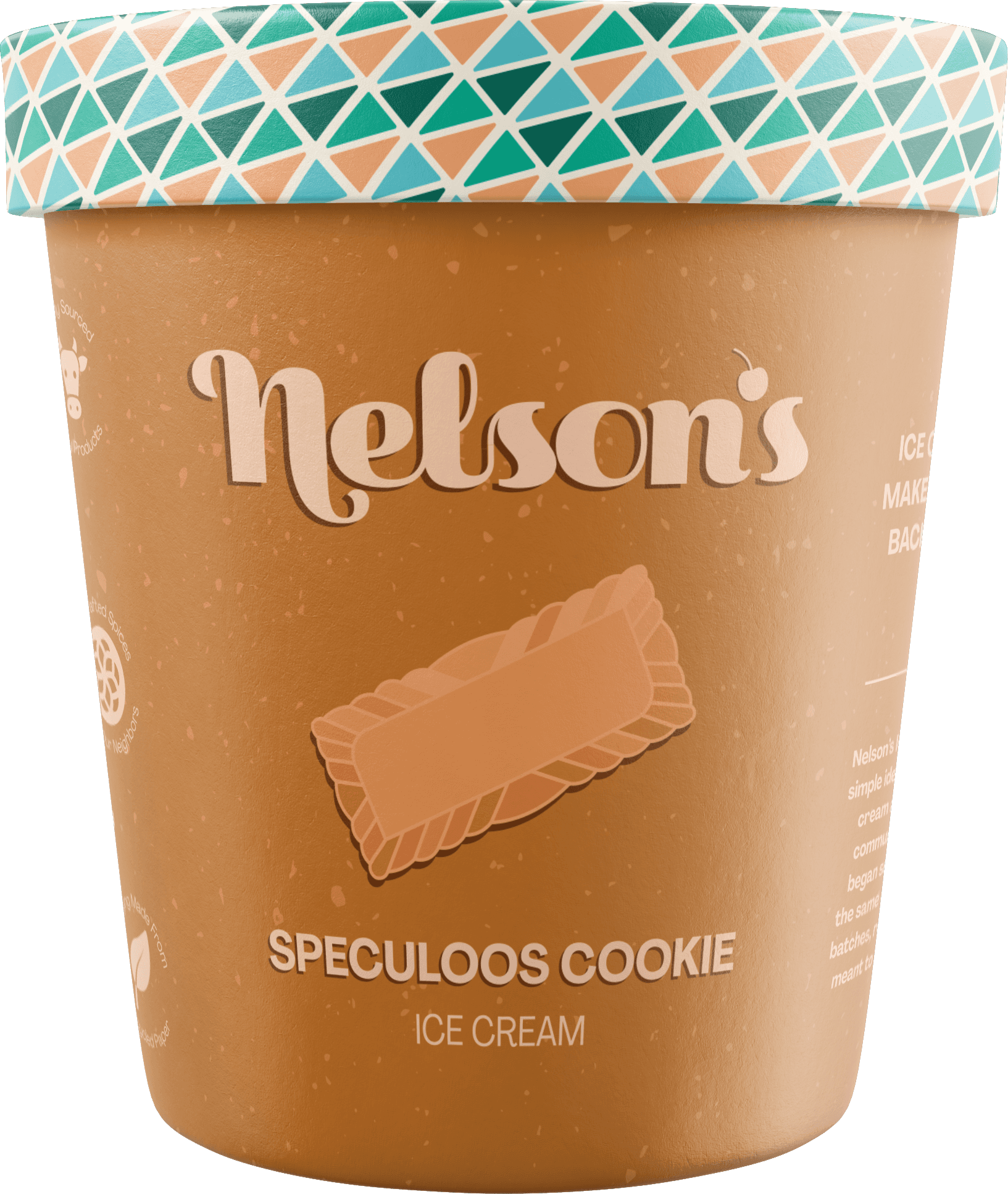
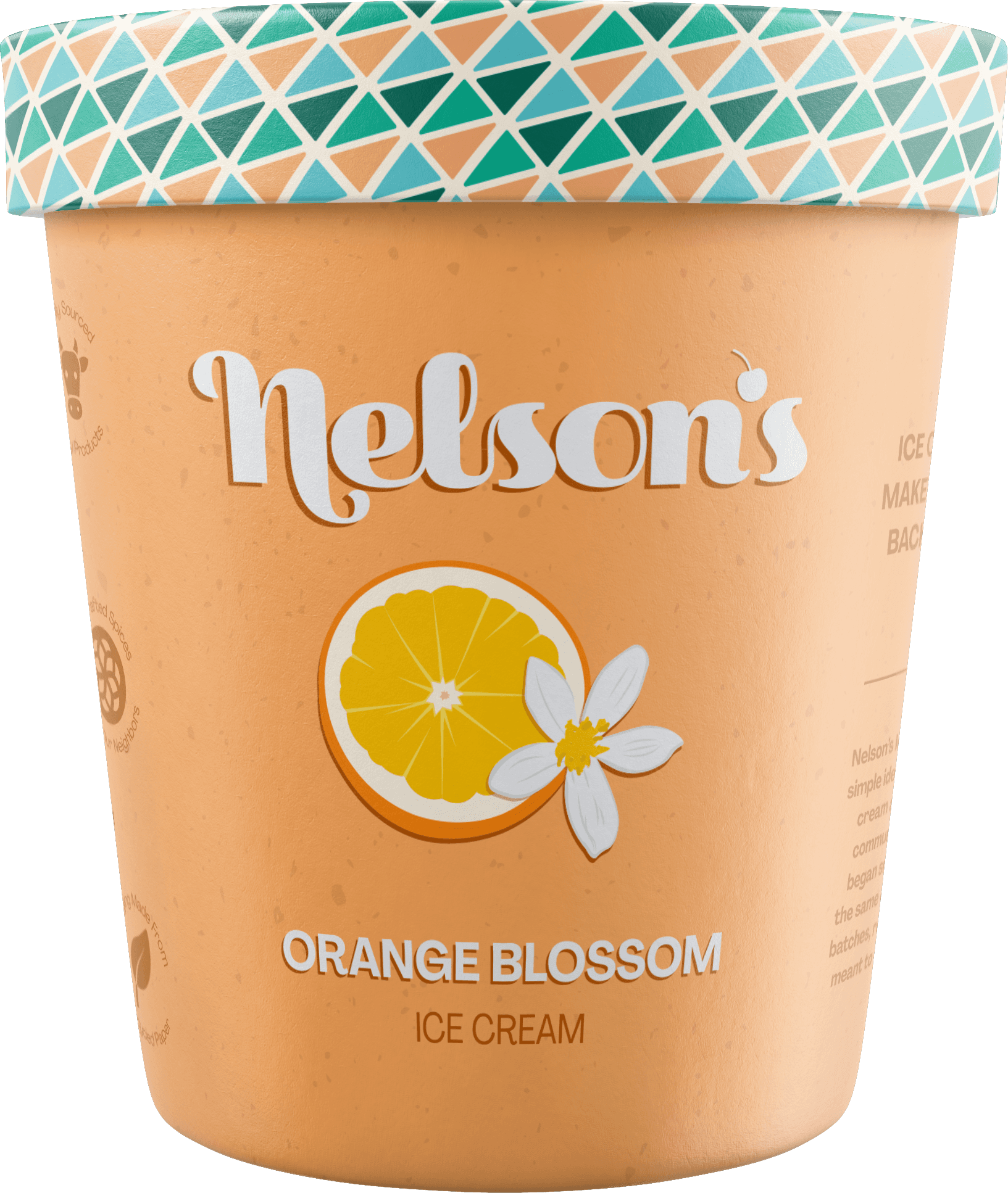
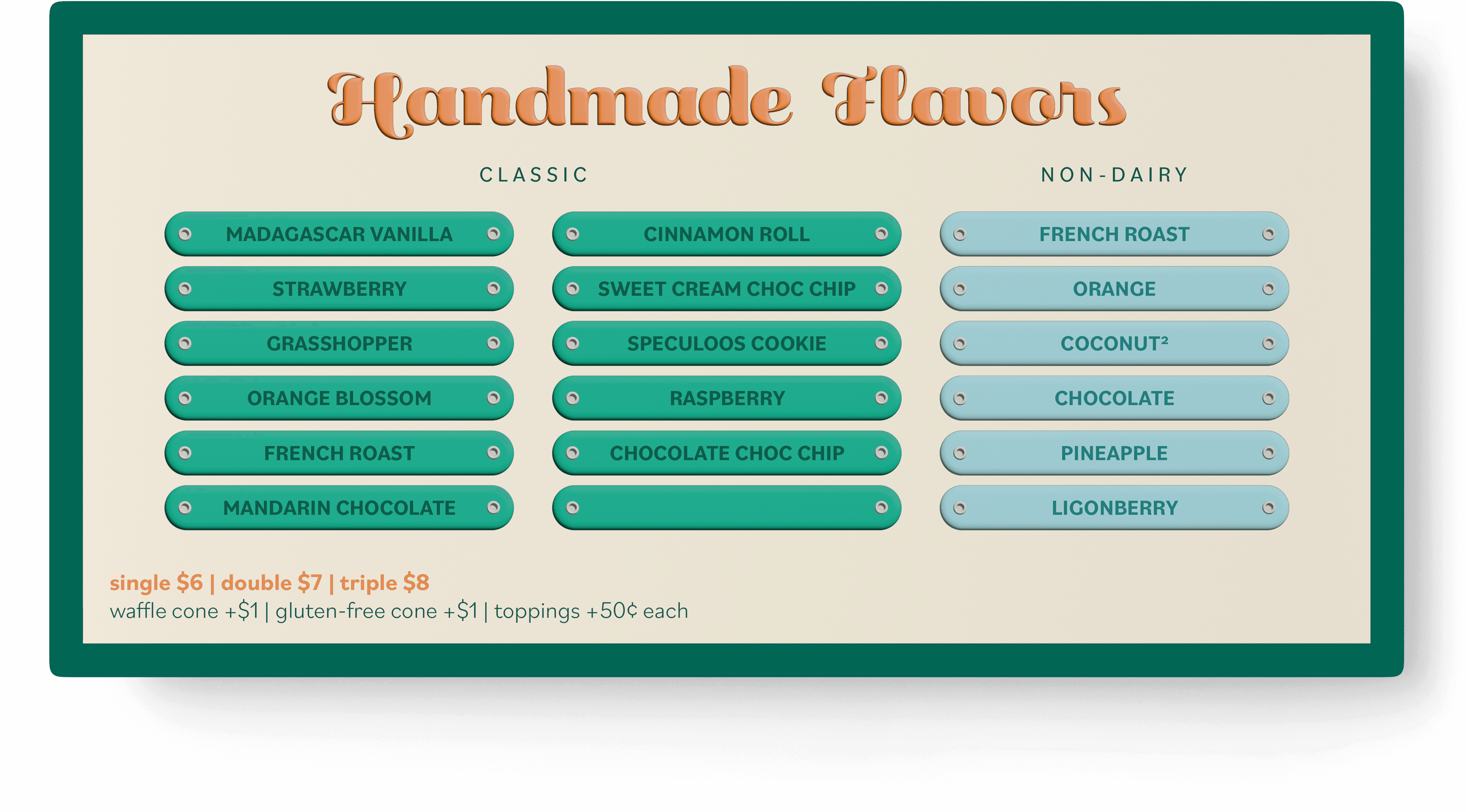
The logo features a custom wordmark with soft curves and personality. The cherry icon and cone patterns are subtle hints to ice cream. The pattern varies in colors depending on the flavor of the ice cream, which can be seen on the rims of pint packaging.

Packaging
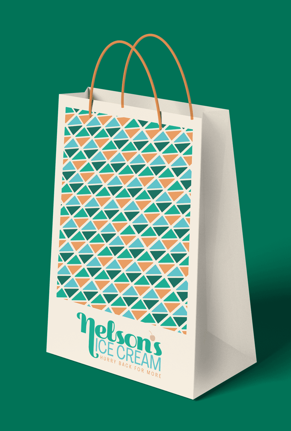

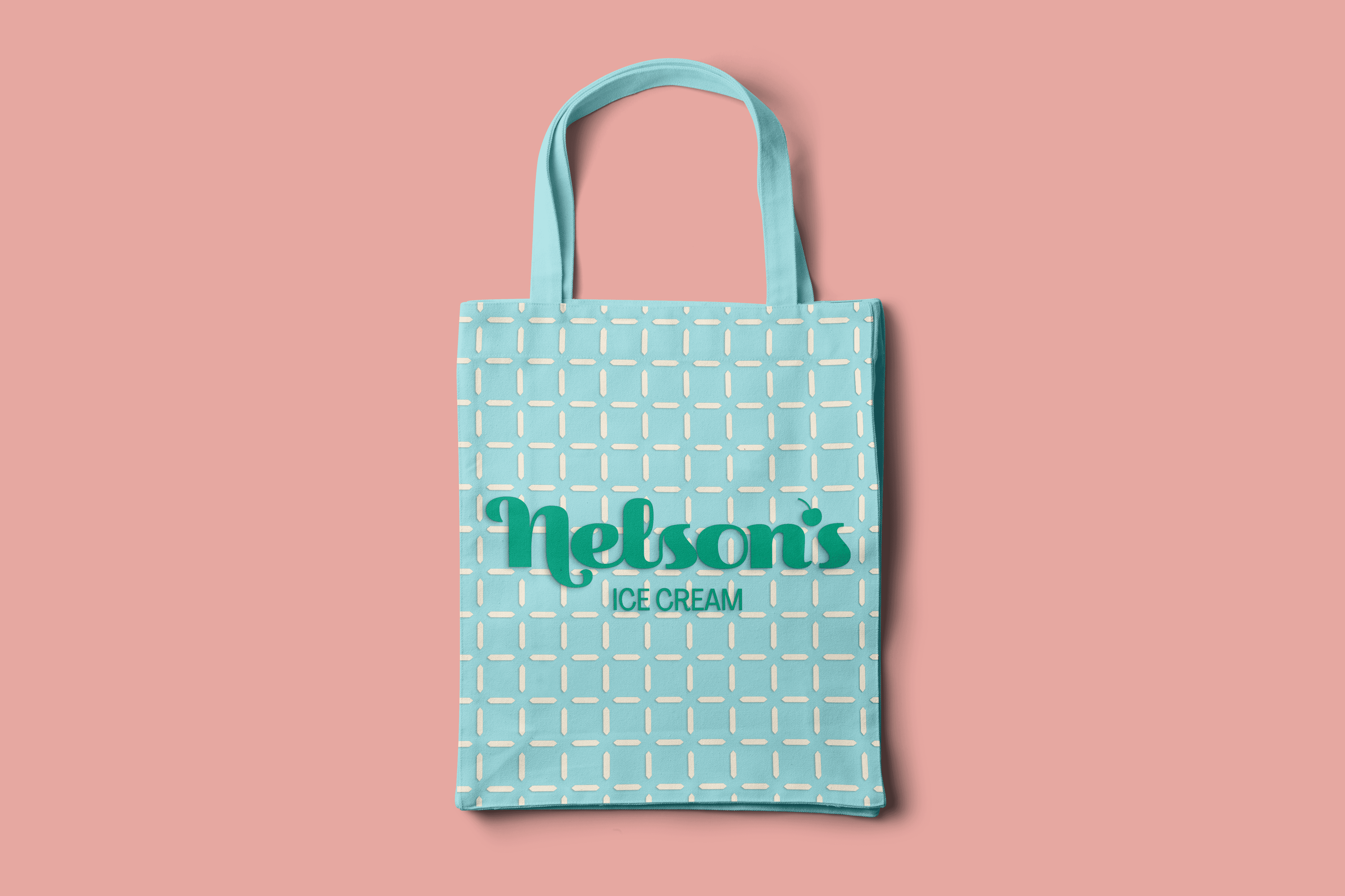
Retail Products


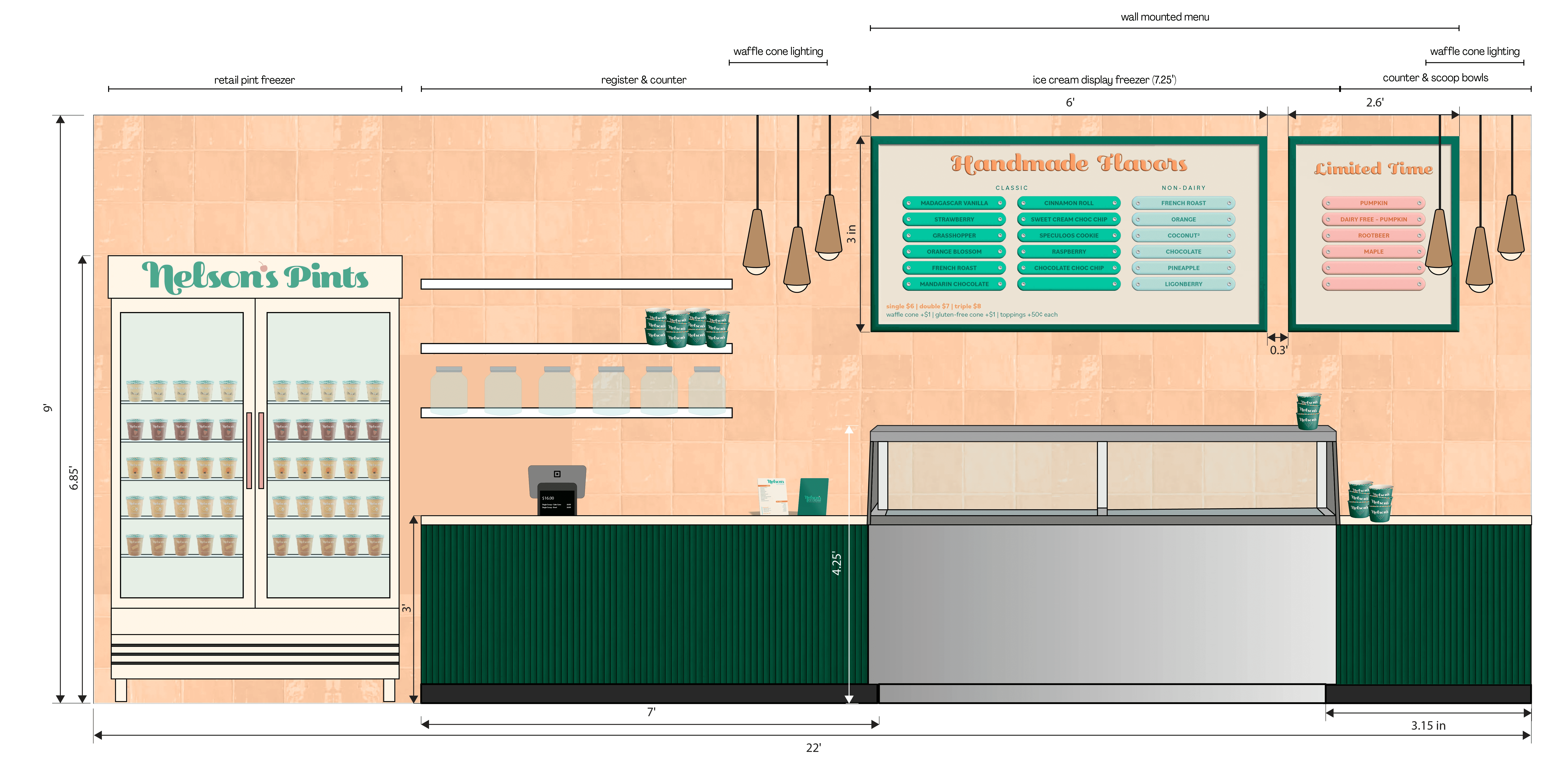
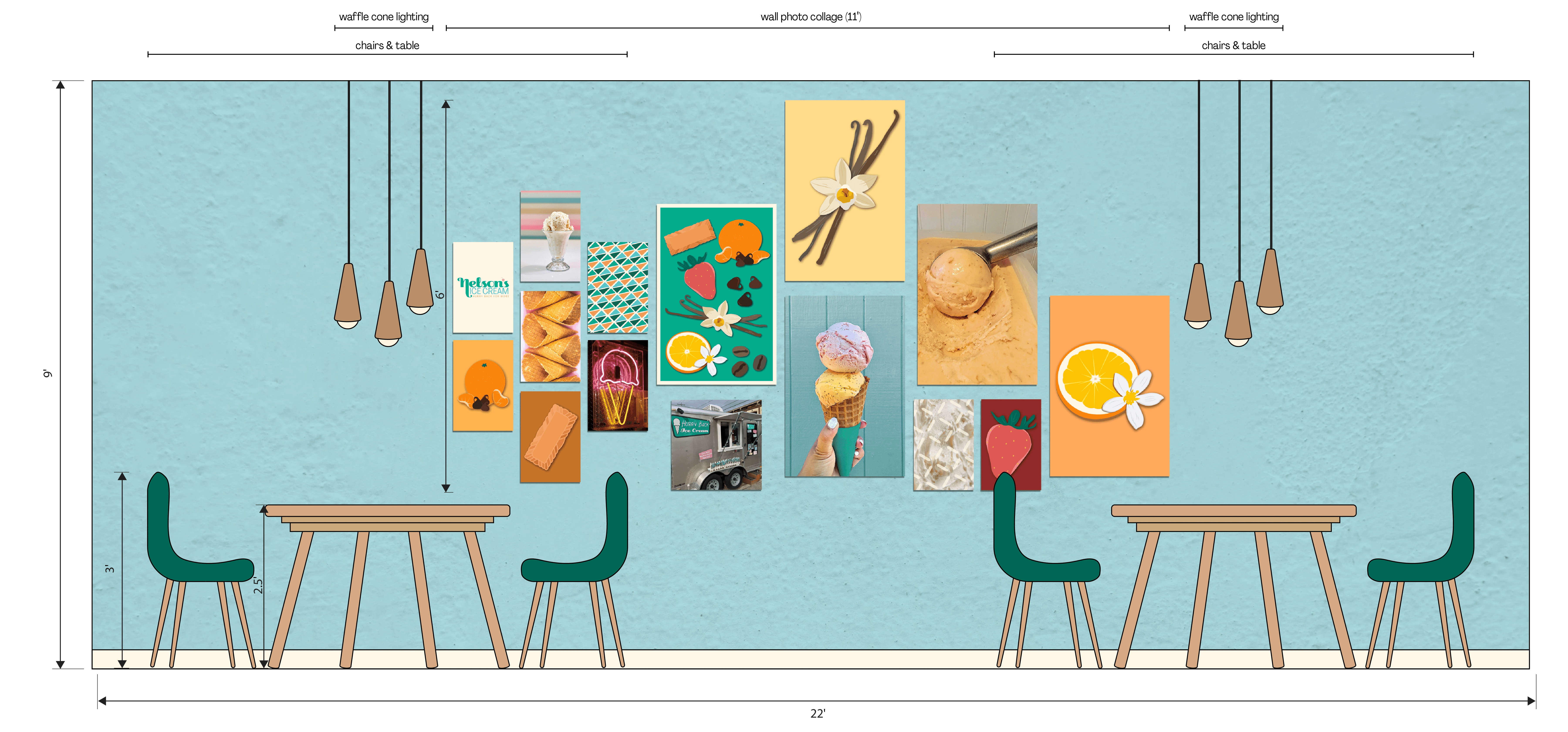
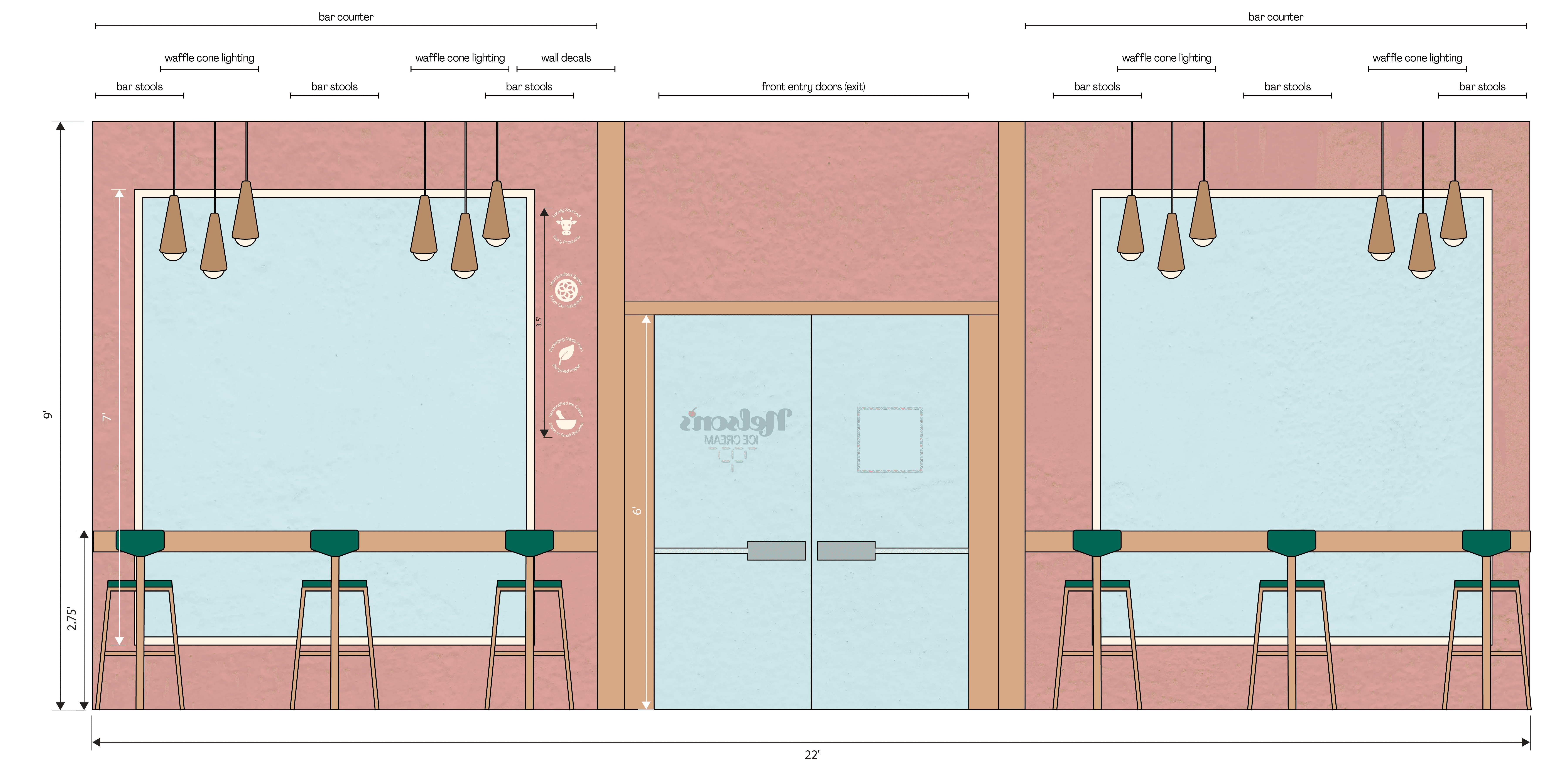
Brand in use


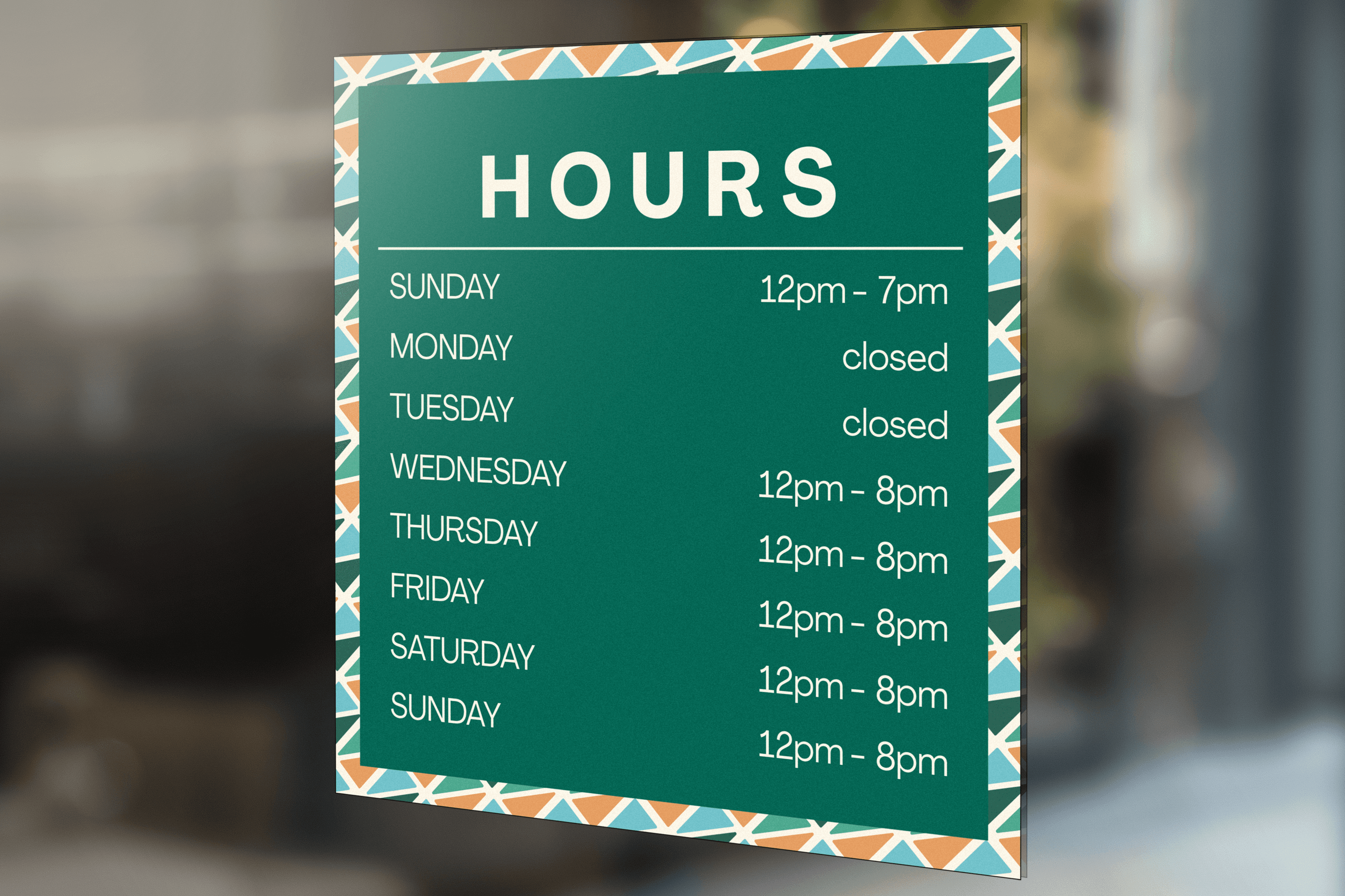

Graphic Elevations